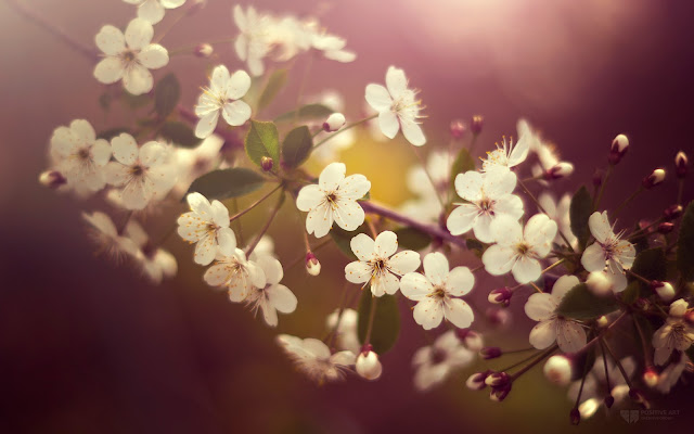
You can see the example in this picture below, moving the cursor changes to normal but keeps the edge.

Obviously there will be images that will fit better these effects than others, but regardless of that we do, there should be made a few observations:
- It is made with CSS styles so as some of you might already know, it will not recognize browsers, specifically Internet Explorer, so using IE browser does not show any effect.
- Hovering around the image will change with a transition effect, but only in Firefox.
- The images are not centered, you will have to align to left (default), or right.
Adding a Vintage Effect to Blogger Images
Step 1. Go to Template > Edit HTML
Step 2. Select the "Expand widget templates" box
Step 3. Search for the following piece of code:
]]></b:skin>
Step 4. Just above it, add the following CSS code:
/* Vintage Images
----------------------------------------------- */
.vintage img {
padding:0;
float:left;
}
.vintage {
border:10px solid #000;
position: relative;
float: left; /* Change to right if you want the images to be aligned to the right */
margin-right: 20px;
margin-bottom: 20px;
}
.vintage:before {
content: "";
display: block;
position: absolute;
top: 0;
bottom: 0;
left: 0;
right: 0;
background-color: rgba(255,102,0, 0.6); /* sepia */
background-image:url(https://blogger.googleusercontent.com/img/b/R29vZ2xl/AVvXsEh3tGkL02OxqIBIIpivrFsG2_FBOuP6clAXhF1FjQkStI44WLTkGx0MpePfMEstP5m3mS-Dr07AhjfghbMA1pW0F68aFWyqvmG3JYaYmqI_b3QdgaXpp_xoHvavQLLHZsaFddxX_pFORB4/s0/grunge.png);
background-size: cover;
box-shadow: inset 0 0 50px #000, inset 0 0 50px #000, inset 0 0 50px #000;
-moz-transition: all 1s;
-webkit-transition: all 1s;
-o-transition: all 1s;
transition: all .1s;
}
.vintage:hover:before {
background: none;
box-shadow:none;
-moz-transition: all 1s;
-webkit-transition: all 1s;
-o-transition: all 1s;
transition: all .1s;
}
Note: In the first code, you see in bold the line that corresponds to the color of the image, you can change it to any other color, these are some examples of traditional vintage:
background-color: rgba(0,0,255, 0.5); /* blue */
background-color: rgba(0,255,0, 0.5); /* green */
background-color: rgba(0,255,255, 0.5); /* cyan */
background-color: rgba(255,0,0, 0.5); /* red */
background-color: rgba(255,0,240, 0.5); /* violet */
If you want the image to not change to its original state on mouse hover, then remove the last code:
.vintage:hover:before {
background: none;
box-shadow:none;
-moz-transition: all 1s;
-webkit-transition: all 1s;
-o-transition: all 1s;
transition: all .1s;
}
Step 5. After you've made your changes, click on Save Template
Step 6. Finally, add this code inside your posts each time you want to apply the vintage effect to an image (switch to HTML tab if you want to use this code inside your post)
<div class="vintage">
<img border="0" src="URL of the image" /></div>
<div style="clear: both;"/>
And add the URL of the image to where is the text in blue.
And that's it, with this little experiment you can have your vintage-style images using CSS only. Enjoy!


Tidak ada komentar:
Posting Komentar