Tampilkan postingan dengan label Blog Design. Tampilkan semua postingan

Jumat, 20 September 2013

Customizing Numbered Lists in Posts + 3 Examples

From the Compose tab of a Blogger post, we can create numbered lists using the "Numbered List" tool.

blogger gadgets, blogger widgets

A numbered list is achieved through the HTML code of a "ordered list". You don't have to worry about adding the HTML, because the editor does it for you by using this tool. If you go to the HTML tab, you'll see that the list you created appears something like this:
   <ol>
<li>The content of the 1st. element</li>
<li>The content of the 2nd. element</li>
<li>The content of the 3rd. element</li>
<li>The content of the 4th. element</li>
    etc...
  </ol>
This tool will automatically number each element of the list taking an "order", hence the name "ordered lists in HTML". In each element a number is successively generated (from 1 onwards), though you can not see this in the HTML code.

Using ordered lists in posts


Creating numbered lists is very suitable for giving any instructions. It is ideal for cooking blogs where the steps in a recipe has to be numbered, or in those blogs that share tutorials... but can be used in any type of blog that need to number something.

By default, when using this tool, the numbered elements will look like:

  1. Nulla tincidunt, neque nec laoreet iaculis, tellus libero sagittis nisl, sed commodo lacus nulla ac sapien. Pellentesque vel magna vitae diam hendrerit bibendum tempus at magna. 
  2. Nulla pellentesque egestas sagittis. Cras blandit bibendum ante nec placerat. Nulla volutpat diam non quam suscipit et ornare nisi porttitor. Quisque eget elit nulla, et imperdiet nisi. 
  3. Vivamus sit amet nibh vel enim aliquam auctor. Phasellus fringilla eros leo, nec varius lacus. Vestibulum id dolor a nisl venenatis varius in nec enim. Pellentesque feugiat arcu ac purus rhoncus dapibus. 
  4. Etiam rutrum quam ac est bibendum cursus. In porttitor nunc odio, vel porttitor nisi. Pellentesque velit est, sodales luctus feugiat et, porta quis lacus. Vivamus non mauris urna, non commodo dui. 

However, we can customize the elements on the list with CSS. To achieve this, we will rely on this interesting tutorial from 456 Berea ST, that explains a technique in which using some key properties of CSS, we could customize both the numbers of each element in the list, also the content of each element.

The trick basically involves canceling the default numbering with "list-style: none", and then use automatic numbering properties: "counter-reset" and "counter-increment". Then the property "content" is added to the index of the counter that is created using the previous two properties.

Examples

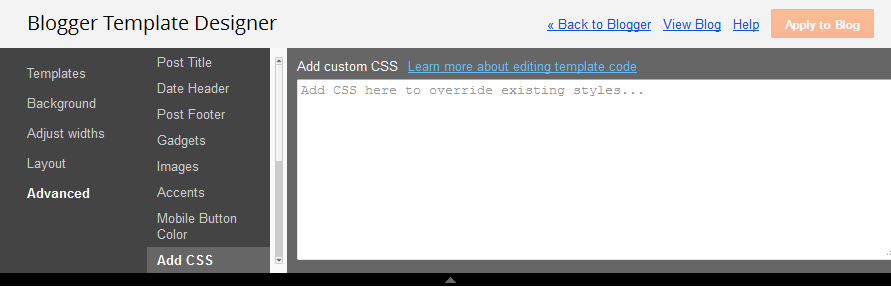
Here are three examples that I have prepared for those of you who want to customize numbered lists and if you will like one of them, simply copy and paste the CSS code by going to Template > Customize > Advanced > Add CSS. Of course, later, you can customize the background colors, borders, etc..

Style 1.

  1. Nulla tincidunt, neque nec laoreet iaculis, tellus libero sagittis nisl, sed commodo lacus nulla ac sapien. Pellentesque vel magna vitae diam hendrerit bibendum tempus at magna. 
  2. Nulla pellentesque egestas sagittis. Cras blandit bibendum ante nec placerat. Nulla volutpat diam non quam suscipit et ornare nisi porttitor. Quisque eget elit nulla, et imperdiet nisi. 
  3. Vivamus sit amet nibh vel enim aliquam auctor. Phasellus fringilla eros leo, nec varius lacus. Vestibulum id dolor a nisl venenatis varius in nec enim. Pellentesque feugiat arcu ac purus rhoncus dapibus. 
  4. Etiam rutrum quam ac est bibendum cursus. In porttitor nunc odio, vel porttitor nisi. Pellentesque velit est, sodales luctus feugiat et, porta quis lacus. Vivamus non mauris urna, non commodo dui. 
.post-outer ol{
 counter-reset:li;
 margin-left:0;
 padding-left:0
}
.post ol li{
 position:relative;    
 margin:0 0 20px 2em !important;
 padding:4px 8px !important;
 list-style:none;
 *list-style: decimal;
}
.post ol li:before{
 content:counter(li);
 counter-increment:li;
 position:absolute;
 top:-8px;
 left:-39px;
 font-family:'Oswald', serif;
 font-size:40px; /* font size*/
 width:34px;
 margin:0 0 10px 0;
 padding:4px !important;
 color:#727272; /* font color */
 text-align:center;
}
Style 2.

  1. Nulla tincidunt, neque nec laoreet iaculis, tellus libero sagittis nisl, sed commodo lacus nulla ac sapien. Pellentesque vel magna vitae diam hendrerit bibendum tempus at magna. 
  2. Nulla pellentesque egestas sagittis. Cras blandit bibendum ante nec placerat. Nulla volutpat diam non quam suscipit et ornare nisi porttitor. Quisque eget elit nulla, et imperdiet nisi. 
  3. Vivamus sit amet nibh vel enim aliquam auctor. Phasellus fringilla eros leo, nec varius lacus. Vestibulum id dolor a nisl venenatis varius in nec enim. Pellentesque feugiat arcu ac purus rhoncus dapibus. 
  4. Etiam rutrum quam ac est bibendum cursus. In porttitor nunc odio, vel porttitor nisi. Pellentesque velit est, sodales luctus feugiat et, porta quis lacus. Vivamus non mauris urna, non commodo dui. 
.post-outer ol{
counter-reset:li;
margin-left:0;
padding-left:0
}
.post ol li{ /* the style of each element */
position:relative;
margin:0 0 20px 2em !important;
padding:4px 8px !important;
list-style:none;
*list-style: decimal;
border:1px solid #e2e3e2; /* border color */
background:#f2f2f2; /* background color */
text-indent:10px;
}
.post ol li:before{ /* the numbers' style */
content:counter(li);
counter-increment:li;
position:absolute;
top:-5px;
left:-5px;
font-family:'Oswald', serif;
font-size:14px;
width:12px;
margin:0 0 10px 0;
padding:4px !important;
color:#727272; /* text color */
text-align:left;
background:#e2e2e2; /* background color */
text-indent:2px
}
.post ol li:after{
content:"";
position:absolute;
top:-5px;
left:14px;
width: 0px;
height: 0px;
border-style: solid;
border-width: 5px 0 0 5px;
border-color: transparent transparent transparent #aeaeae; /* triangle color */
}
Style 3.

  1. Nulla tincidunt, neque nec laoreet iaculis, tellus libero sagittis nisl, sed commodo lacus nulla ac sapien. Pellentesque vel magna vitae diam hendrerit bibendum tempus at magna. 
  2. Nulla pellentesque egestas sagittis. Cras blandit bibendum ante nec placerat. Nulla volutpat diam non quam suscipit et ornare nisi porttitor. Quisque eget elit nulla, et imperdiet nisi. 
  3. Vivamus sit amet nibh vel enim aliquam auctor. Phasellus fringilla eros leo, nec varius lacus. Vestibulum id dolor a nisl venenatis varius in nec enim. Pellentesque feugiat arcu ac purus rhoncus dapibus. 
  4. Etiam rutrum quam ac est bibendum cursus. In porttitor nunc odio, vel porttitor nisi. Pellentesque velit est, sodales luctus feugiat et, porta quis lacus. Vivamus non mauris urna, non commodo dui. 
.post ol{
counter-reset:li;
margin-left:0;
padding-left:0
}
.post ol li{
position:relative;    
margin:0 0 13px 2em !important;
padding:4px 8px !important;
list-style:none;
*list-style:decimal;
}
.post ol li:before{
content:counter(li);
counter-increment:li;
position:absolute;
top:0;
left:-2em;
width:27px;
margin-right:8px;
padding:3px 1px 4px 0 !important;
color:#fff; /* text color */
font-size:16px;
background:url(https://blogger.googleusercontent.com/img/b/R29vZ2xl/AVvXsEji6Rwpo4Z5UMBec3YPAUA4dFuHa7DxUAHsgIPiUBWoCqdqTRlXm6ETdaKMVzsl9UmlymJnZeFmiA1r-dGvCrIoX1ADX8cHKdkPWt3Hmfa3-J0O01CyOXV9QFGIRMP6wDjnaPNwHIi_lFc/s1600/blue.png) no-repeat left top;
font-weight:bold;
text-align:center
}
In this last example, I decided to use an image for the circle (highlighted in blue) as the background of the number. We can create the circle with CSS, but it will be squared in Internet Explorer 8.

Anyway, here I leave other images of circles with other colors that you can use if you want.


Note: With red are highlighted the values that can be edited in the CSS of these three examples, and added some comments highlighted in /* green */, so that you can know what each thing does.

Compatibility:

This will work in all browsers including IE8 - in the case of Internet Explorer 7, the number' styles will not be seen as it does not support the :before or :after pseudo-elements. However, I have added a line in the CSS that's specific for that browser and will bring up the default numbering of the ordered list.

Hopefully it will be useful for you ;)

4 Different Styles For the Popular Posts Widget

Blogger allows us to easily add a "Popular Posts" widget, that we select from its list of gadgets, and we can do that by going to the "Layout" of our Blog.

This gadget, as the name implies, shows which are the most visited blog posts, and you can set it to display the info you want in four possible combinations: (1) only the title of the post, (2) a thumbnail of the image and the post title, (3) post title with a summary, and (4) post title with a thumbnail and a post snippet.

This is an element that you shouldn't miss in your blog because it encourages your visitors to navigate through your content, which can result in higher income if you're monetizing your blog because it would generate an increase in the number of pages visited, and in turn, can attract the users' interest to subscribe to the blog and to read interesting content.

Preliminary steps: Add the gadget, if you haven't done it yet.


1. Select the "Layout" tab and add the "Popular Posts" gadget in that part of your blog you want to appear, such as in your sidebar, by clicking on "Add a Gadget".

2. Configure the widget to show only the post titles. You can do this by clicking on the "image thumbnail" and "snippet" checkboxes, as shown in the following image.

3. After configuring the widget, save the changes by clicking on Save, and then Save arrangement.

How to add the CSS to create the style of the Popular Posts widget


1. Choose a style, then copy the CSS that appears below the image that shows the style.

2. Select the "Template" tab, then click on Customize > Advanced > Add CSS and then paste the CSS style that you like the most.

blogger tutorials
3. Once you add the CSS, Save changes by clicking on the "Apply to Blog" button.

And that's it! I've already customized the popular posts widget, when it only shows post titles.

Styles

Here is the CSS of each style, just choose the one you like the best and put it on your blog. You can see each of these styles in action in the following demo blog:

http://demo-blog343.blogspot.com

Style 1:
blogger gadgets, blogger widgets
#PopularPosts1 h2{
padding:7px 0 3px 0;
width:100%;
margin:0;
font-size:1.3em;
text-indent:-12px;
font-size:18px;
text-align:center;
color: #000; /* Color of the widget's title */
}
#PopularPosts1 ul{
list-style:none;
counter-reset:li;
padding:8px 0px 1px;
left:-8px;
width:290px;
}
#PopularPosts1 li{
position:relative;
margin:0 0 10px 0;
padding: 3px 2px 0 7px;
left:-5px;
width:285px;
border:1px solid #ccc;
}
#PopularPosts1 ul li:before{
content:counter(li);
counter-increment:li;
position:absolute;
display:block;
top:-5px;
left:-5px;
font-size:18px;
width:14px;
margin:0 0 10px 0;
padding:4px 4px 4px 3px;
color:#333;
text-align:left;
background:#E8E8E8;
text-indent:2px;
}
#PopularPosts1 ul li:after{
content:"";
position:absolute;
top:-5px;
left:15px;
width: 0px;
height: 0px;
border-top:5px outset transparent;
border-left:5px solid #aeaeae;
}

#PopularPosts1 ul li a{
font-size:17px; /* Font size of the links */
color:#444; /* Color of the links */
font-style: italic;
margin-left:17px;
display:block;
min-height:25px;
text-decoration:none;
padding:0 4px 3px 0;
}
#PopularPosts1 ul li:hover{
background:#f9f9f9;
border:1px solid #aaa;
}
#PopularPosts1 ul li a:hover{
color:#0174DF;
}

Style 2:
blogger gadgets, blogger widgets
#PopularPosts1 h2{
position:relative;
padding:8px 10px 6px 10px;
width:100%;
margin:0;
font-size:17px;
background: #bada55;
color:#222; /* Color of the widget's title */
text-align:center;
}
#PopularPosts1 h2:before{
position:absolute;
content:"";
top:-6px;
right:-5px;
width: 0px;
height: 0px;
border-bottom:24px outset transparent;
border-top:24px outset transparent;
border-right:24px solid #fff; /* Color of the triangle */
}

#PopularPosts1 h2:after{
position:absolute;
content:"";
top:-7px;
left:-5px;
width: 0px;
height: 0px;
border-bottom:24px outset transparent;
border-top:24px outset transparent;
border-left:24px solid #fff; /* Color of the triangle */
}

#PopularPosts1 ul{
list-style:none;
counter-reset:li;
padding:10px;
left:-8px;
width:100%;
}

#PopularPosts1 li{ /* Styles of each element */
width:100%;
position:relative;
left:0;
margin:0 0 1px 12px;
padding:4px 5px;
}

#PopularPosts1 ul li:before{ /* style of the numbers */
content:counter(li);
counter-increment:li;
position:absolute;
top:2px;
left:-23px;
font-size:35px; /* Font size of the numbers */
width:20px;
color:#666; /* Color of the text */
}
#PopularPosts1 ul li a{
display:block;
position:relative;
left:-30px;
width:100%;
margin:0;
padding: 9px 3px 10px 29px;
font-size:15px; /* Font size of the links */
font-style: italic;
color:#333; /* Color of the links */
text-decoration:none;
transition: all .1s ease-in-out;
}
#PopularPosts1 ul li a:hover{
color:#3366ff;
margin-left:3px;
}

Style 3:
blogger gadgets, blogger widgets
#PopularPosts1 h2{
position:relative;
right:-2px;
padding:8px 63px 6px 17px;
width:100%;
margin:0;
font-size:16px;
background:#C00000; /* Background color */
color:#f2f2f2; /* Color of the widget's title */
text-align:left;
text-indent:18px;
}
#PopularPosts1 h2:before{
position:absolute;
content:"";
top:33px;
right:0px;
width: 0px;
height: 0px;
border-bottom:12px outset transparent;
border-left:12px solid #800000;
}
#PopularPosts1 h2:after{
position:absolute;
content:"";
top:-6px;
left:-5px;
width: 0px;
height: 0px;
border-bottom:24px outset transparent;
border-top:24px outset transparent;
border-left:24px solid #fff;
}
#PopularPosts1 ul{
list-style:none;
counter-reset:li;
padding:10px;
left:-8px;
width:100%;
}
#PopularPosts1 li{
width:100%;
position:relative;
left:0;
margin:7px 0 16px 12px;
padding:10px  4px 0 5px;
}
#PopularPosts1 ul li:before{
content:counter(li);
counter-increment:li;
position:absolute;
top:-2px;
left:-20px;
font-size:33px;
width:20px;
color:#888888;
}

#PopularPosts1 ul li a{
display:block;
font-size:14px; /* Font size of the links */
color: #666; /* Color of the links */
text-decoration:none;
transition: all .1s ease-in-out;
}
#PopularPosts1 ul li a:hover{
color:#3366FF;
margin-left:3px;
}

Style 4:
blogger gadgets, blogger widgets
#PopularPosts1 h2{
padding:8px 10px 3px 0;
width:100%;
margin:0;
font-size:16px;
position:relative;
left:-20px;
display:block;
border-bottom:2px solid #ccc;
}
#PopularPosts1 ul{
list-style:none;
counter-reset:li;
padding:10px;
width:100%;
}
#PopularPosts1 li{ /* Styles of each element */
width:100%;
position:relative;
left:0;
margin:0 0 6px 10px;
padding:4px 5px;
}
#PopularPosts1 ul li:before{ /* Style of the numbers */
content:counter(li);
counter-increment:li;
position:absolute;
top:3px;
left:-39px;
font-size:21px;
width:28px;
height:28px;
border-radius: 50%;
color:#777; /* Text color */
border: 2px solid #ddd; /* Rounded border color */
padding:0;
text-indent:9px;
}
#PopularPosts1 ul li a{
display:block;
position:relative;
left:-45px;
width:100%;
margin:0;
min-height:28px;
padding: 5px 3px 3px 39px;
color:#333; /* color of the links */
text-decoration:none;
font-size:14px; /* Font size of the links */
font-style: italic;

}
#PopularPosts1 ul li a:hover{
color:#3366ff;
margin-left:3px;
}

Final Notes

All the CSS is valid. I just have to mention that the numbering is not visible in Internet Explorer 7, since that version of the browser does not support properties that make the numbers appear. For example in the 4th style, the circles look squared in IE8 and earlier versions since, these versions do not support a property that makes them look as circles.

Fonts will be inherited from the template, since they have not been declared in the CSS.

Kamis, 19 September 2013

Adding a Youtube Video in the Background of a Blogger blog

Some of you might have wondered how to put a video to play in the blog's background, so that instead of having just a color or an image, to have a video. We can do this thanks to the jQuery plugin Tubular that lets you use a YouTube video as a background of a web page.

Although the result can be very original and attractive, I must say it has three drawbacks: they can not be silenced, if the video has ads, they will also appear, and it can slow the loading time of the blog, so if anyone wants to use it, may consider putting it only on special occasions, or on blogs that load very quickly.

Also it can be done in HTML5, the problem with this method is that you need to load the video in 3 different formats (.mp4, .webm and .ovg) along with a picture for browsers that do not support them, so this YouTube option seems more practical to me, despite the drawbacks.

blogger gadgets, blogger tricks, blogger widgets

You can see it working on this demo blog

Steps 

1. The first step is to just above the </head> tag, this script:
<script src='http://ajax.googleapis.com/ajax/libs/jquery/1.10.2/jquery.min.js' type='text/javascript'/>

<script type='text/javascript'>
//<![CDATA[
/* jQuery tubular plugin
|* by Sean McCambridge
|* http://www.seanmccambridge.com/tubular
|* Copyright 2012
|* licensed under the MIT License
|* Enjoy.
|*
|* Thanks,
|* Sean */

var videoWidth = 853;
var videoRatio = 16/9;
var defaultDiv = 'wrapper-video';

jQuery.fn.tubular = function(videoId,wrapperId) {
wrapperId = (typeof(wrapperId) == undefined) ? 'wrapper-video' : wrapperId;
t = setTimeout("resizePlayer()",1000);

jQuery('html,body').css('height','100%');
jQuery('body').prepend('<div id="yt-container" style="overflow: hidden; position: fixed; z-index: 1;"><div id="ytapiplayer">You need Flash player 8+ and JavaScript enabled to view this video.</div></div><div id="video-cover" style="position: fixed; width: 100%; height: 100%; z-index: 2;"></div>');
jQuery('#' + wrapperId).css({position: 'relative', 'z-index': 99});

var ytplayer = 0;
var pageWidth = 0;
var pageHeight = 0;
var videoHeight = videoWidth / videoRatio;
var duration;

var iframe = '<iframe id="myytplayer" width="' + videoWidth + '" height="' + videoHeight + '" src="http://www.youtube.com/embed/' + videoId + '?autoplay=1&controls=0&modestbranding=1&showinfo=0&hd=1&iv_load_policy=3&version=3&wmode=transparent&loop=1&playlist=' + videoId + '" frameborder="0" allowfullscreen></iframe>';

jQuery('#ytapiplayer').html(iframe);
jQuery(window).resize(function() {
resizePlayer();
});
return this;
}

function onYouTubePlayerReady(playerId) {
ytplayer = document.getElementById("myytplayer");
ytplayer.setPlaybackQuality('medium');
ytplayer.mute();
}

function resizePlayer() {
var newWidth = jQuery(window).width();
var newHeight = jQuery(window).height();
jQuery('#yt-container, #video-cover').width(newWidth).height(newHeight);
if (newHeight > newWidth / videoRatio) {
newWidth = newHeight * videoRatio;
}
jQuery('#myytplayer').width(newWidth).height(newWidth/videoRatio);
}

//]]>
</script>
And this one too:
<script type='text/javascript'>
//<![CDATA[
$().ready(function() {
$('body').tubular('61BLn00AN_w','wrapper-video');
});
//]]>
</script>
2. Then locate the <body> tag (CTRL + F)
Or if you are using a template from Template Designer, find this line:
<body expr:class='&quot;loading&quot; + data:blog.mobileClass'>
3. Under either of these two, add this:
<div id='wrapper-video'>
4. Now search for the </body> tag, and before it put this:
</div>
Save the changes and that's it. In red you must put the ID of Youtube video, the ID are the characters that appear at the end of the URL:


Remember: There is no option to mute, so if you don't want to have sound as in the demo blog, you have to choose a video that has no sound. I also recommend using a video in HD in case you don't want any black parts to show around it.

If you are using jQuery, remove other versions that you have to avoid duplication and have problems.

Author | jQuery Tubular

Create a Background Slideshow for Blogger

In the previous post we saw how to make the blog's background fill the screen regardless of the resolution of the monitor. The method that we'll use now with jQuery is a plugin called BackStretch which also has the option of creating a slideshow of pictures as a blog wallpaper without losing the property of adjusting to the width and height of the screen.

slideshow for blogger, blogger widgets

What we will do in this entry is just this, try to make the blog's background to have some images that are changing, all with fade effect between each transition.

You can see an example in this demo blog.

To put this slideshow in the blog's background, just go to Template - Edit HTML and before </head> add the following code:
<script src='http://ajax.googleapis.com/ajax/libs/jquery/1.10.2/jquery.min.js' type='text/javascript'/>
<script>
//<![CDATA[
/*
* jQuery Backstretch
* Version 1.2.8
* http://srobbin.com/jquery-plugins/jquery-backstretch/
* Add a dynamically-resized background image to the page
* Copyright (c) 2012 Scott Robbin (srobbin.com)
* Licensed under the MIT license
* https://raw.github.com/srobbin/jquery-backstretch/master/LICENSE.txt
*/
;(function(a){a.backstretch=function(p,b,l){function s(){if(p){var b;0==c.length?c=a("<div />").attr("id","backstretch").css({left:0,top:0,position:m?"fixed":"absolute",overflow:"hidden",zIndex:-999999,margin:0,padding:0,height:"100%",width:"100%"}):c.find("img").addClass("deleteable");b=a("<img />").css({position:"absolute",display:"none",margin:0,padding:0,border:"none",zIndex:-999999,maxWidth:"none"}).bind("load",function(d){var b=a(this),e;b.css({width:"auto",height:"auto"});e=this.width||a(d.target).width();d=this.height||a(d.target).height();n=e/d;q();b.fadeIn(g.speed,function(){c.find(".deleteable").remove();"function"==typeof l&&l()})}).appendTo(c);0==a("body #backstretch").length&&(0===a(window).scrollTop()&&window.scrollTo(0,0),a("body").append(c));c.data("settings",g);b.attr("src",p);a(window).unbind("resize.backstretch").bind("resize.backstretch",function(){"onorientationchange"in window&&window.pageYOffset===0&&window.scrollTo(0,1);q()})}}function q(){try{j={left:0,top:0},rootWidth=h=o.width(),rootHeight=r?window.innerHeight:o.height(),f=h/n,f>=rootHeight?(k=(f-rootHeight)/2,g.centeredY&&(j.top="-"+k+"px")):(f=rootHeight,h=f*n,k=(h-rootWidth)/2,g.centeredX&&(j.left="-"+k+"px")),c.css({width:rootWidth,height:rootHeight}).find("img:not(.deleteable)").css({width:h,height:f}).css(j)}catch(a){}}var t={centeredX:!0,centeredY:!0,speed:0},c=a("#backstretch"),g=c.data("settings")||t;c.data("settings");var o,m,r,n,h,f,k,j;b&&"object"==typeof b&&a.extend(g,b);b&&"function"==typeof b&&(l=b);a(document).ready(function(){var b=window,d=navigator.userAgent,c=navigator.platform,e=d.match(/AppleWebKit\/([0-9]+)/),e=!!e&&e[1],f=d.match(/Fennec\/([0-9]+)/),f=!!f&&f[1],g=d.match(/Opera Mobi\/([0-9]+)/),h=!!g&&g[1],i=d.match(/MSIE ([0-9]+)/),i=!!i&&i[1];o=(m=!((-1<c.indexOf("iPhone")||-1<c.indexOf("iPad")||-1<c.indexOf("iPod"))&&e&&534>e||b.operamini&&"[object OperaMini]"==={}.toString.call(b.operamini)||g&&7458>h||-1<d.indexOf("Android")&&e&&533>e||f&&6>f||"palmGetResource"in window&&e&&534>e||-1<d.indexOf("MeeGo")&&-1<d.indexOf("NokiaBrowser/8.5.0")||i&&6>=i))?a(window):a(document);r=m&&window.innerHeight;s()});return this}})(jQuery);
//]]>
</script>
<script>
//<![CDATA[
var images = [
 "Image URL",
 "Image URL",
 "Image URL",
 "Image URL",
 "Image URL",
  ];

  $(images).each(function(){
 $('<img/>')[0].src = this;
  });
  var index = 0;
$.backstretch(images[index], {speed: 1000});
  var slideshow = setInterval(function() {
  index = (index >= images.length - 1) ? 0 : index + 1;
    $.backstretch(images[index]);
  }, 5000);
//]]>
</script>
Here add the URLs of the images that will be the background of your blog.
If you would like to add more pictures, just add after the var images = [ another line like this:
 "Image URL",
The images will be changing in the order you have added them, if you want these to appear in a random order, then change the second part of the code with this:
<script>
//<![CDATA[
var images=new Array();
images[ 1 ]="Image URL";
images[ 2 ]="Image URL";
images[ 3 ]="Image URL";
images[ 4 ]="Image URL";
images[ 5 ]="Image URL";

  Array.prototype.shuffle = function() {
  var len = this.length;
  var i = len;
  while (i--) {
  var p = parseInt(Math.random()*len);
  var t = this[i];
  this[i] = this[p];
  this[p] = t;
  }
};

  images.shuffle();
  $(images).each(function(){
 $('<img/>')[0].src = this;
  });
  var index = 0;
$.backstretch(images[index], {speed: 1000});
  var slideshow = setInterval(function() {
  index = (index >= images.length - 1) ? 0 : index + 1;
    $.backstretch(images[index]);
  }, 5000);
//]]>
</script>
You can also add more pictures by adding a line like this:
images[ 6 ]="Image URL";
But you will see that in this case there are some consecutive numbers in blue, so if you add another such as 6, then the next one should be 7, etc..

In both cases you can change the duration of each image which is in the 5000 value that is at the end of the script.
The advantage of this slideshow in the blog's background is that images are automatically resized to the size of the monitor, so that, no matter of the resolution, it should look good.

It is worth remembering that if you are using Scriptaculous, you have to make some changes, and if you already use jQuery, should leave only one version.

Author page | Backstretch

Rabu, 18 September 2013

Rounded Corners and Shadows for Images using CSS

Here are some unique border styles that you can apply to blogger images by using the border-radius property and defining either all four corners simultaneously or applying the rounded border only to some of them.

One of the advantages of CSS3 is that we can apply rounded borders without complicating things too much and one of the options would be to use these edges or borders to images in the blog posts, to which we can also add some hover effects such as shading and rounded borders accompanied by transitions.

Note: if you need more info about how to add rounded corners on images, follow these links:
- CSS Basics. How to Apply Rounded Corners On Images #1
- CSS Basics. How to Apply Rounded Corners On Images #2

Below are a few examples of these borders and how the images behave when you hover over them.
If you want to use one of these styles, just copy the code below the image, then go to Template, click on the Edit HTML button and paste that code before ]]></b:skin> (CTRL + F to find it)
.post-body img {
border:0;
padding:0;
-moz-transition: all 1s;
-webkit-transition: all 1s;
-o-transition: all 1s;
}
.post-body img:hover {
box-shadow: 0px 0px 15px #000; /* Shadow */
border-radius: 50%; /* Rounded border */
-moz-transition: all 1s;
-webkit-transition: all 1s;
-o-transition: all 1s;
cursor:pointer;
}
.post-body img {
background:#FFF; /* background color around the image */
padding:15px; /* space between border and image */
-moz-transition: all 1s;
-webkit-transition: all 1s;
-o-transition: all 1s;
}
.post-body img:hover {
box-shadow: 0px 0px 15px #000; /* Shadow */
border-radius: 0% 50%; /* Rounded border */
-moz-transition: all 1s;
-webkit-transition: all 1s;
-o-transition: all 1s;
cursor:pointer;
}
.post-body img {
background:#FFF; /* the background color around the image */
padding:15px; /* The Space Between Border and Image */
border-radius: 50% 0; /* Rounded border */
box-shadow: 0px 0px 15px #000; /* Shadow */
-moz-transition: all 1s;
-webkit-transition: all 1s;
-o-transition: all 1s;
}
.post-body img:hover {
border-radius:0; /* This removes the border roundness (value 0) */
-moz-transition: all 1s;
-webkit-transition: all 1s;
-o-transition: all 1s;
cursor:pointer;
}
.post-body img {
box-shadow: 0px 0px 15px #000; /* Shadow */
border-radius: 50%; /* Rounded border */
border:0;
padding:0;
-moz-transition: all 1s;
-webkit-transition: all 1s;
-o-transition: all 1s;
}
.post-body img:hover {
box-shadow: 0; /* With this we remove the shadow (value 0) */
border-radius: 0; /* This removes the border roundness (value 0) */
-moz-transition: all 1s;
-webkit-transition: all 1s;
-o-transition: all 1s;
cursor:pointer;
}
.post-body img {
border-radius: 45% / 20%; /* Rounded border */
box-shadow: 0px 0px 15px #000; /* Shadow */
padding:0;
-moz-transition: all 1s;
-webkit-transition: all 1s;
-o-transition: all 1s;
}
.post-body img:hover {
border-radius: 0; /* This removes the roundness of border (value 0) */
-moz-transition: all 1s;
-webkit-transition: all 1s;
-o-transition: all 1s;
cursor:pointer;
}
So these effects will apply to all images uploaded to your Blogger posts. But if you want to apply them only on certain pictures then change .post-body img with .rounded  and .post-body img:hover with .rounded:hover
Then add the rounded class selector in the image's code:
<img class="rounded" src="Image URL"/>
These are just some examples, however, you can modify them anytime by adding or deleting more CSS styles, it depends on everybody's tastes or needs. But as you have seen, we can make the images look way more attractive and this has been done only with CSS ;)

Selasa, 17 September 2013

How to make the background image of the blog fill the entire screen

A constant question is how to make the background image of the blog always fill the entire screen regardless of the resolution of the monitor. And that is when we put a background image as measured by our monitor forgetting that there are actually monitors of all resolutions, very small and very large. So if we put an image according to our screen, there will be someone with a bigger monitor that surely will not see the whole picture or it will be repeated, and in this case, using very small monitors, the image will be seen incomplete.
blogger tricks, blogger tutorials, blogger blogspot

Here I will discuss two solutions to this, one using CSS3, and another with jQuery. With either of these two, we'll make the background image of the page to fill the entire screen regardless of the resolution of it.

CSS3


The first option is using CSS3, the advantage with this method is that we do not overload the blog with scripts, we use only the background-size property that is responsible for conducting what we want.
The disadvantage is that this property is supported only by modern browsers, so in the case of Internet Explorer, it will only be seen for version 9 and above, in other browsers there should be no problem.

The method is very simple, just go to Template - Edit HTML, locate the background that is within body { and replace it with this:
background: url(Image URL) no-repeat center center fixed;
background-size: cover;
It would look something like this:
body {
background: url(URL of the image) no-repeat center center fixed;
background-size: cover;
margin:0;
color:#000;
font:x-small Georgia Serif;
font-size/* */:/**/small;
font-size: /**/small;
text-align: center;
}
Just put the URL of the image and that's it.

jQuery


With this method we will use jQuery with BackStretch plugin, the advantage is that it works in all browsers, including IE7 and above. The disadvantage is not major if you already use jQuery, because the plugin is actually small.

To use this method in your blog, go to Template - Edit HTML and before </head> paste this script:
<script src='http://ajax.googleapis.com/ajax/libs/jquery/1.10.2/jquery.min.js' type='text/javascript'/>
<script type='text/javascript'>
//<![CDATA[
/*
* jQuery Backstretch
* Version 1.2.8
* http://srobbin.com/jquery-plugins/jquery-backstretch/
* Add a dynamically-resized background image to the page
* Copyright (c) 2012 Scott Robbin (srobbin.com)
* Licensed under the MIT license
* https://raw.github.com/srobbin/jquery-backstretch/master/LICENSE.txt
*/
;(function(a){a.backstretch=function(p,b,l){function s(){if(p){var b;0==c.length?c=a("<div />").attr("id","backstretch").css({left:0,top:0,position:m?"fixed":"absolute",overflow:"hidden",zIndex:-999999,margin:0,padding:0,height:"100%",width:"100%"}):c.find("img").addClass("deleteable");b=a("<img />").css({position:"absolute",display:"none",margin:0,padding:0,border:"none",zIndex:-999999,maxWidth:"none"}).bind("load",function(d){var b=a(this),e;b.css({width:"auto",height:"auto"});e=this.width||a(d.target).width();d=this.height||a(d.target).height();n=e/d;q();b.fadeIn(g.speed,function(){c.find(".deleteable").remove();"function"==typeof l&&l()})}).appendTo(c);0==a("body #backstretch").length&&(0===a(window).scrollTop()&&window.scrollTo(0,0),a("body").append(c));c.data("settings",g);b.attr("src",p);a(window).unbind("resize.backstretch").bind("resize.backstretch",function(){"onorientationchange"in window&&window.pageYOffset===0&&window.scrollTo(0,1);q()})}}function q(){try{j={left:0,top:0},rootWidth=h=o.width(),rootHeight=r?window.innerHeight:o.height(),f=h/n,f>=rootHeight?(k=(f-rootHeight)/2,g.centeredY&&(j.top="-"+k+"px")):(f=rootHeight,h=f*n,k=(h-rootWidth)/2,g.centeredX&&(j.left="-"+k+"px")),c.css({width:rootWidth,height:rootHeight}).find("img:not(.deleteable)").css({width:h,height:f}).css(j)}catch(a){}}var t={centeredX:!0,centeredY:!0,speed:0},c=a("#backstretch"),g=c.data("settings")||t;c.data("settings");var o,m,r,n,h,f,k,j;b&&"object"==typeof b&&a.extend(g,b);b&&"function"==typeof b&&(l=b);a(document).ready(function(){var b=window,d=navigator.userAgent,c=navigator.platform,e=d.match(/AppleWebKit\/([0-9]+)/),e=!!e&&e[1],f=d.match(/Fennec\/([0-9]+)/),f=!!f&&f[1],g=d.match(/Opera Mobi\/([0-9]+)/),h=!!g&&g[1],i=d.match(/MSIE ([0-9]+)/),i=!!i&&i[1];o=(m=!((-1<c.indexOf("iPhone")||-1<c.indexOf("iPad")||-1<c.indexOf("iPod"))&&e&&534>e||b.operamini&&"[object OperaMini]"==={}.toString.call(b.operamini)||g&&7458>h||-1<d.indexOf("Android")&&e&&533>e||f&&6>f||"palmGetResource"in window&&e&&534>e||-1<d.indexOf("MeeGo")&&-1<d.indexOf("NokiaBrowser/8.5.0")||i&&6>=i))?a(window):a(document);r=m&&window.innerHeight;s()});return this}})(jQuery);
//]]>
</script>
<script>
$.backstretch("URL of the image");
</script>

Put the URL of the image where indicated and ready.

As you can see both systems are easy to apply, each with its pros and cons, but the result is the same, extending the background image to fit the screen of any monitor regardless of the resolution of it.

Remember that in the case of jQuery method, you should verify that you are not using Mootools or Scriptaculous, if so you will have to implement some changes in the script to make it compatible.
And if you already use jQuery remember having only one version, the last one.

Selasa, 03 September 2013

Possibly the most simple jQuery Slider

Do you have jQuery in your blog and space to insert 10 lines of code? If the answer is yes and you also want to have an automatic slideshow, this is the simplest code I've seen so far.

That code having a succession of simple images placed inside a box with a common general container would give this result:


1. Adding the JavaScript

If you do not have jQuery, then you should add this line just after ]]></b:skin> to load this popular slideshow:
<script src='http://ajax.googleapis.com/ajax/libs/jquery/1.8/jquery.min.js' type='text/javascript'/>

Once confident that we have the library in our template, we need to add the same line to make the series of images function as a slider:
<script type="text/javascript">//<![CDATA[
$(function(){
    $('#slider div:gt(0)').hide();
    setInterval(function(){
      $('#slider div:first-child').fadeOut(0)
         .next('div').fadeIn(1000)
         .end().appendTo('#slider');}, 4000);
});
//]]></script>

We can save changes to the template because that is all. It is simple but you will see that it works and does what it has to do. Now we just have to put the images where we want to display, in the manner discussed below.

2. Create the slider

After adding the codes above in our template (although you could add it directly into a gadget, on a page or even in an entry as you see here) we can create a viewer as you saw above. We just have to use this HTML structure below to add the images:
<div id="slider">
    <div><img src="IMAGE_URL"/></div>
    <div><img src="IMAGE_URL"/></div>
    <div><img src="IMAGE_URL"/></div>
</div>

I do not know how you see it but it is all you need.

For me this is quite lightweight and efficient, much more than most libraries that are used perhaps too often.

Settings


The last three numbers of the plugin allow us to adjust some things. All are expressed in milliseconds (4000 = 4 seconds)

fadeOut(0): Time for the outgoing image
fadeIn(1000): Time for the next image
('#slider');},4000): Time spent in each image

How it Works


And for the curious who want to learn things...

$('#slider div:gt(0)').hide();
With gt(x) we select all the divs from number x. In this case 0 is the first, so what we do with this line is to hide (hide) all the boxes except the first, which will be the image visible initially.

setInterval(function(){ [what we will do] }, 4000);
We need to reiterate a few things from time to time and we do with setInterval, indicating the delay time between each set.

$('#slider div:first-child').fadeOut(0)
Within each of these intervals we remove (fadeOut) the first box (div:first-child) that is in the relationship of images...

.next('div').fadeIn(1000)
...and we make the following box (next) appearing gradually (fadeIn).

.end().appendTo('#slider');
Finally we have the first image and place it at the end (appendTo) of the "list".

end() resets the count of elements that we move forward with next(). Thus, the first child made earlier to disappear is the one we sent down the stack and not the image that is now visible.

Variants and customization


As you have seen CSS is not necessary for the slider to work, but using it we can change its look, allow the use of images of different sizes, include labels and even improve the transition. Here are some ideas.


DEMO TEXT1


DEMO TEXT2


DEMO TEXT3


We can limit the overall container size and prevent overflow for larger images. And then we will put rounded corners, border and then center them.
#slider {
overflow: hidden;
width: 500px;
height: 300px;
border:3px solid #b8b8b8;
border-radius: 40px;
margin: 0 auto;
padding: 0;
position: relative;
}

If we place the parent boxes of the images absolutely with respect to the general container (for that we put before the relative), these will overlap each other. In this way the fadeOut may give them some time to be "visible" (we changed 0 to 1000) and a smoother transition between images. The mixture of images is produced in the second demo.

In the images, the max-width serves us to always take up the entire width and min-height so that even if they are distorted, there will remain no space below when they are less than 300px.
#slider > div {
position:absolute;
top:0;
left:0;
}
#slider img {
width:100%;
min-height:300px;
margin:0;
padding:0;
border:0;
}

And if we add other elements on the images (in this example a text), we'll just label them with a span or paragraph (p) and position them in the CSS in an absolute manner, placing them in the exact place where we want with top/bottom - left/right.
#slider p {
position: absolute;
bottom: 30px;
left: 0;
display: block;
width: 400px;
height: 24px;
margin:0;
padding: 5px 0;
color: #eee;
background: #990000;
font-size: 22px;
line-height:22px;
text-align:center;
}

The markup in the HTML for this last, includes also a link to the image, so it would be like this:
<div id="slider">
<div><a href="Link_URL1"><img src="Image_URL1" /></a><p>TEXT1</p></div>
<div><a href="Link_URL2"><img src="Image_URL2" /></a><p>TEXT2</p></div>
<div><a href="Link_URL3"><img src="Image_URL3" /></a><p>TEXT3</p></div>
</div>

Minggu, 02 Juni 2013

Horizontal menu with sub-tabs in two columns for Blogger

This is a very nice horizontal menu in which its sub-tabs are displayed in two columns and is also made with CSS, without any scripts.
blogger navigation menu, css menu, drop-down menu
The "advantage" so to speak, is that the sub-tabs when arranged in two columns are not very long, so it will be neat and less space along. You can see an example here:


Adding A Horizontal Menu With Sub Tabs in Two Columns To Blogger

STEP 1: In Blogger, go to your "Layout" and on the "Page Elements" section.
  • Click on the "Add a Gadget" link just under your header image
  • From the Gadget's List, select "HTML/JavaScript" option.
STEP 2: Simply copy and paste this ENTIRE code into your widget. Note: Leave the "Title" section of this widget blank.
<div id='menucol'>
<div id='topwrapper'>
<ul id='top'>
<li><a href='http://YOUR URL HERE.com'>Tab 1 Title Here</a></li>
<li><a href='http://YOUR URL HERE.com'>Tab 2 Title Here</a></li>
<li><a class='submenucol' href='#'>Tab 3 Title Here</a>
<ul>
<li><a href='http://YOUR URL HERE.com'>Sub Tab 3.1</a></li>
<li><a href='http://YOUR URL HERE.com'>Sub Tab 3.2</a></li>
<li><a href='http://YOUR URL HERE.com'>Sub Tab 3.3</a></li>
<li><a href='http://YOUR URL HERE.com'>Sub Tab 3.4</a></li>
<li><a href='http://YOUR URL HERE.com'>Sub Tab 3.5</a></li>
<li><a href='http://YOUR URL HERE.com'>Sub Tab 3.6</a></li>
</ul>
</li>
<li><a class='submenucol' href='#'>Tab 4 Title Here</a>
<ul>
<li><a href='http://YOUR URL HERE.com'>Sub Tab 4.1</a></li>
<li><a href='http://YOUR URL HERE.com'>Sub Tab 4.2</a></li>
<li><a href='http://YOUR URL HERE.com'>Sub Tab 4.3</a></li>
<li><a href='http://YOUR URL HERE.com'>Sub Tab 4.4</a></li>
<li><a href='http://YOUR URL HERE.com'>Sub Tab 4.5</a></li>
<li><a href='http://YOUR URL HERE.com'>Sub Tab 4.6</a></li>
</ul>
</li>
<li><a class='submenucol' href='#'>Tab 5 Title Here</a>
<ul>
<li><a href='http://YOUR URL HERE.com'>Sub Tab 5.1</a></li>
<li><a href='http://YOUR URL HERE.com'>Sub Tab 5.2</a></li>
<li><a href='http://YOUR URL HERE.com'>Sub Tab 5.3</a></li>
<li><a href='http://YOUR URL HERE.com'>Sub Tab 5.4</a></li>
<li><a href='http://YOUR URL HERE.com'>Sub Tab 5.5</a></li>
<li><a href='http://YOUR URL HERE.com'>Sub Tab 5.6</a></li>
<li><a href='http://YOUR URL HERE.com'>Sub Tab 5.7</a></li>
<li><a href='http://YOUR URL HERE.com'>Sub Tab 5.8</a></li>
</ul>
</li>
<li><a href='http://YOUR URL HERE.com'>Tab 6 Title Here</a></li>

</ul>
<br class='clearit'/>
</div>
</div>
Customize your main tabs by changing the Tab Titles to whatever you want. Include a URL for each one if you want it to be 'clickable'. If not, you can just put a # sign where it says http://YOUR URL HERE.com

You can add or delete as many of the main tabs as you need, just make sure to copy the entire code for the main tab for each additional tab you want:
<li><a href='http://YOUR URL HERE.com'>Tab 7 Title Here</a>
<ul>
<li><a href='http://YOUR URL HERE.com'>Sub Tab 7.1</a></li>
<li><a href='http://YOUR URL HERE.com'>Sub Tab 7.2</a></li>
<li><a href='http://YOUR URL HERE.com'>Sub Tab 7.3</a></li>
</ul>
</li>
STEP 3: Now let's go a step further and add the CSS style in our Template
  • Go to Template > Edit HTML
  • Click on the sideways arrow next to <b:skin>...</b:skin> 

  • Then click anywhere inside the code area and search - using CTRL + F keys - for the ]]></b:skin> tag and just above ]]></b:skin> add this code:
/* Horizontal menu with 2 columns
----------------------------------------------- */
#menucol {
width:940px;
height:37px;
background-image: -moz-linear-gradient(top, #666666, #000000);
background-image: -webkit-gradient(linear, left top, left bottom, color-stop(0.00, #666666), color-stop(1.0, #000000));
filter: progid:DXImageTransform.Microsoft.Gradient(gradientType=0,startColorStr=#666666,endColorStr=#000000);
border-bottom:1px solid #666666;
border-top:1px solid #666666;
margin:0 auto;padding:0 auto;
overflow:hidden;
}
#topwrapper {
width:940px;
height:40px;
margin:0 auto;
padding:0 auto;
}
.clearit {
clear: both;
height: 0;
line-height: 0.0;
font-size: 0;
}
#top {
width:100%;
}
#top, #top ul {
padding: 0;
margin: 0;
list-style: none;
}
#top a {
border-right:1px solid #333333;
text-align:left;
display: block;
text-decoration: none;
padding:10px 12px 11px;
font:bold 14px Arial;
text-transform:none;
color:#eee;
}
#top a:hover {
background:#000000;
color:#F6F6F6;
}
#top a.submenucol {
background-image: url(https://blogger.googleusercontent.com/img/b/R29vZ2xl/AVvXsEh-rRjq94BFCfuzLx6Ylq8HAO3hvUbOe91WzwnJ0ZV8WKaoG9HYTFUKpKHgB_8llh3VV8BIBgO-To2M8p40OdJnCUbFKtFkBq2YnbS8500shgyRK19FY1B66OUjjHpNRTvn8aBbbCv_wF4/s1600/arrow_white.gif);
background-repeat: no-repeat;
padding: 10px 24px 11px 12px;
background-position: right center;
}
#top li {
float: left;
position: relative;
}
#top li {
position: static !important;
width: auto;
}
#top li ul, #top ul li {
width:300px;
}
#top ul li a {
text-align:left;
padding: 6px 15px;
font-size:13px;
font-weight:normal;
text-transform:none;
font-family:Arial, sans-serif;
border:none;
}
#top li ul {
z-index:100;
position: absolute;
display: none;
background-color:#F1F1F1;
margin-left:-80px;
padding:10px 0;
border-radius: 0px 0px 6px 6px;
box-shadow:0 2px 2px rgba(0,0,0,0.6);
filter:alpha(opacity=87);
opacity:.87;
}
#top li ul li {
width:150px;
float:left;
margin:0;
padding:0;
}
#top li:hover ul, #top li.hvr ul {
display: block;
}
#top li:hover ul a, #top li.hvr ul a {
color:#333;
background-color:transparent;
text-decoration:none;
}
#top ul a:hover {
text-decoration:underline!important;
color:#444444 !important;
}
  • Now find (CTRL + F) this line:
/* Tabs
  • It will also have some little lines beneath:
/* Tabs
----------------------------------------------- */
  • And just below these little lines, delete the code below until you reach at:
/* Columns
----------------------------------------------- */
  • Instead of the code that you have removed, add this one:
#crosscol ul {z-index: 200; padding:0 !important;}
#crosscol li:hover {position:relative;}
#crosscol ul li {padding:0 !important;}
.tabs-outer {z-index:1;}
.tabs-inner {padding: 0 0px;}
See this screenshot for more info:
menu for blogger, blogger gadgets, blogger widgets
STEP 4: The final step is to Save the Template and you are done!

Visit your blog to see a beautiful navigation menu just below header.
If you have any questions or need help, leave a comment below.

Fade In/Out Page Loading Effect On Blogger Posts

A very common effect in jQuery is the fade effect that hides or shows an element by fading it, and we can use it in many ways as for example in the blog's navigation. The following script does just that, by loading the page with a fading effect when we browse on internal links that are in the blog, such as post titles, labels links, archive, navigation links, etc..
jQuery effect, fade in effect, blogger jQuery
You can see an example in this demo blog, click on the title of any post and see the fading effect when the page is loading.

How To Implement the Fade In Loading Effect

1) To put this fading effect on your blog, go to your Template > Edit HTML :

fading effect, blogger blogspot, blogger tricks

2) Click anywhere inside the code area and search for the </head> tag using CTRL + F keys:


3) Then, just above </head> add the following code:
<script src='http://ajax.googleapis.com/ajax/libs/jquery/1.8.2/jquery.min.js' type='text/javascript'/>
<script type='text/javascript'>
//<![CDATA[
$(document).ready(function() {
$("body").css("z-index", "-10");
$("body").fadeIn(0);

$("a").click(function(event){
event.preventDefault();
linkLocation = this.href;
$("body").fadeOut(500, redirectPage); });
function redirectPage() {
window.location = linkLocation;
}
});
//]]>
</script>
<style>
html {
background-color: #F2F2F2; /* Color fading */
}
</style>
4) Save the changes and that's it. In green you can see where to change the color that fades on a loading page.

The original script hides the body of the page while loading, I prefer to change that property with a negative z-index to avoid problems with the search engine robots that may effect the positioning.

Problems?

Consider that such effects could increase the blog loading time, so I recommend using it only when your blog loads fast and does not have too many scripts.

If you already use another version of jQuery remove the other, leaving only this which will be readed first.

If you are using Mootools or Scriptaculous, then you have to make some modifications to the code in order to be compatible.

If you have another script with a fade effect, then it could interfere with this and you might not see anything on the page except the color fading, in such cases it is better without this script.

You can also use this effect only on some links, for example, if you want to appear only when you click on the post titles in the navigation links (older posts and newer posts), and on the top tabs, then replace this line:
$("a").click(function(event){
With this:
$(".post-title a, .blog-pager-older-link, .blog-pager-newer-link, .tabs").click(function(event){
In some cases, the page can load for a second and then load with the fade effect, this may be "normal" because the browser is slow to read the script on page load.

Apart from these drawbacks, I think it's a very elegant way to load blog pages while browsing them, don't you think?

Sabtu, 01 Juni 2013

Using the :before and :after Pseudo Elements on Sidebar Titles

This is another method of using the :after and :before properties and it will work without too many problems in any browser, including IE8. What this trick will do is to divide the header bar into left and right sections, where the left will contain an explanatory title and the right, a related link.

The idea of generating Adobe-like Arrow Headers was actually discussed by css-tricks and adapted to Blogger.

How to Add Adobe-like Headers to Blogger

blogger gadgets, blogger tricks, blogger blogspot

Step 1. Log in to your Blogger dashboard > go to Template > Edit HTML, then click anywhere inside the code area to search - using the CTRL + F keys - for the following tag:
</head>
Step 2. Just above it, copy and paste this code:
 <style>
.module h2 {
  background-color: #D5D5D5;
  border-radius: 20px 0 0 20px;
  color: #FFFFFF;
  font-family: Verdana;
  font-size: 14px;
  line-height: 32px;
  margin: 0;
  padding: 0 0 0 20px;
  text-shadow: 2px 1px 1px #222;
}

.module h2 a {
    border-left: 5px solid #ffffff;
    color: #101921;
    float: right;
    font-size: 14px;
    text-decoration: none;
    text-shadow: none;
    padding: 0 10px;
    position: relative;
   -moz-transition: padding 0.1s linear;
   -webkit-transition: padding 0.1s linear;
   -ms-transition: padding 0.1s linear;
   -o-transition: padding 0.1s linear;
}
.module h2 a:hover {
  padding: 0 32px;
}

.module h2 a:before, .module h2 a:after {
    content: &quot;&quot;;
    height: 0;
    position: absolute;
    top: 50%;
    width: 0;
}
.module h2 a:before {
    border-bottom: 8px solid transparent;
    border-right: 8px solid #ffffff;
    border-top: 8px solid transparent;
    left: -12px;
    margin-top: -8px;
}
.module h2 a:after {
    border-bottom: 6px solid transparent;
    border-top: 6px solid transparent;
    left: -6px;
    margin-top: -6px;
}

.module.blue h2 a {background-color: #A2D5EC;}
.module.blue h2 a:hover {background-color: #C5F0FF;}
.module.blue h2 a:after {border-right: 6px solid #A2D5EC;}
.module.blue h2 a:hover:after {border-right-color: #C5F0FF;}

.module.yellow h2 a {background-color: #FCE98D;}
.module.yellow h2 a:hover {background-color: #FFD700;}
.module.yellow h2 a:after {border-right: 6px solid #FCE98D;}
.module.yellow h2 a:hover:after {border-right-color: #FFD700;}

.module.green h2 a {background-color: #bada55;}
.module.green h2 a:hover {background: #C7E176;}
.module.green h2 a:after {border-right: 6px solid #bada55;}
.module.green h2 a:hover:after {border-right-color: #C7E176;}

.module.red h2 a {background-color: #F0A5B5;}
.module.red h2 a:hover {background-color: #FFC7D2;}
.module.red h2 a:after {border-right: 6px solid #F0A5B5;}
.module.red h2 a:hover:after {border-right-color: #FFC7D2;}
</style>
Step 3. Save the Template.

Screenshot:


Step 4. Now go to Layout and Add a new HTML/JavaScript Gadget with one of the codes below for each of the widget title:

Background in blue:
<div class="module blue">
<h2>Title in <a href="Link URL">Blue</a></h2>
</div>
Background in yellow:
<div class="module yellow">
<h2>Title in <a href="Link URL">Yellow</a></h2>
</div>
Background in green:
<div class="module green">
<h2>Title in <a href="Link URL">Green</a></h2>
</div>
Background in red:
<div class="module red">
<h2>Title in <a href="Link URL">Red</a></h2>
</div>

Note: Change "Title in" text with your widget's title and Blue, Yellow, Green and Red with the text on the right, then add a Link URL to it.

Step 5. After you saved the HTML/Javascript gadgets containing the codes above, drag and drop them just above the widgets you want to show... and Save the Arrangement.
blogger tricks, blogger tutorials

DEMO

You can see how the sidebar titles has been replaced with some cool header bars on this demo blog.