Over the next few weeks, we'll look at each new feature in detail. First up: Motion Charts! The Motion Charts video was briefly one of the top 15 most viral videos on YouTube, so this seems to be a good place to start.
You've probably noticed the new

Motion Charts provide a multi-dimensional, over-time analysis of the data in your report. So, if you click Visualize from the Keywords report, each dot will represent one of your keywords. If you click Visualize from the Referrals report, each dot will represent a referral. By selecting metrics to be represented on the X and Y axis and by the size and color of the dots, you plot each dot in four dimensions. Press Play or drag the slider at the bottom of the chart, and you'll see the data change over time, thereby adding Time as the fifth dimension.
(For developers: Motion Charts use the Trendalyzer Flash widget, which is available for you to use as a gadget in Google Spreadsheets or as a visualization API.)
What can Motion Charts add to my analysis?
The basic premise of Motion Charts is that it makes it easier to notice an important trend. Visualizing data across five dimensions can help you to uncover insights and patterns that would be difficult to discover using traditional two dimensional charts. For example, looking at the traditional keyword report, it's difficult to see how performance metrics pertaining to keywords combine, interact, and change over time.
 You might want to find out, for example, over the past three months, which of the top keywords you're buying are sending new visitors that are highly engaged with the site. And you might want to compare those keywords to ones which are sending visitors that bounced consistently. And importantly, you want to know when exactly keywords shift into these patterns. With a Motion Chart, you can identify the keywords (or any metric) that perform well across multiple dimensions, such as conversions, repeat visitors, and pageviews. You can plot a few things or hundreds of things at once and watch for patterns or outliers as their performance over time is animated. And you can pause and manually rewind or go forward at any time.
Once you notice a pattern or a break in pattern - such as related to a keyword's performance - and when the pattern happened, that's when the investigation begins. You can look at your reports to analyze the origins of the traffic, and then replicate conditions that caused a beneficial pattern, or instead make needed improvements. In this sense, a Motion Chart shows a richer picture of your data that you may be able to profit from.
How do I use Motion Charts?
Each dimension, or metric, can be selected easily with drop down menus around the chart's graph area. There are four metrics:
- x-axis
- y-axis
- color of bubble
- size of bubble
- Click the "Visualize" icon from any report that has a table displaying segmented data (you can always revert to the traditional graphs in your Analytics Reports by selecting a particular report from the lefthand side menu).
- Once the Motion Chart loads, you'll see an array of bubbles. Each bubble represents a different keyword from your report.
- Now select the four different dimensions to plot your data: X-axis, Y-axis, Color, Size. Click on each control to see a menu of metrics you can select from. The X-axis control is underneath the graph area, the Y-axis is to the left, and the Color and Size controls are to the right of the graph area. Let's look at one of these controls to give you the hang of modifying the chart.
The Y-axis control is noted on the left in the screenshot below.
Once you click on any part of this vertical bar, it will expand to show you the variables you can choose from for the Y-Axis. Here is the expanded area, with the rest of the graph grayed out:
Pageviews is being selected. Now, obviously, the higher up a bubble (denoting a keyword in this case) is in the chart, the more the average pageviews for that bubble. You select the other variables in the same way - just click them and select your choice. - Press "Play" at the bottom of your chart to see how your keywords perform over time. If you click on a bubble and check the "Trails" box underneath the Size control, you can map out the bubble's movement over time.


Take a look at the following video - it examines each component of this feature so that you can learn how to get at-a-glance insights from the data you're seeing.
(This example and more are also in this help center article.) We'll finish this example with action-oriented insights you can take away from a Motion Chart.
The data is taken from a Google Analytics account that tracks the e-commerce activity for the business called 'Google Store' (www.googlestore.com). We'll look at a Motion Chart on keywords by clicking "Visualize" on the Keywords report under Traffic Sources. In order to find keywords that have the best conversion rates, we would set up our Motion Chart like this:
Let's look at an example: keywords with high or low conversion rates.
(This example and more are also in this help center article.) We'll finish this example with action-oriented insights you can take away from a Motion Chart.
The data is taken from a Google Analytics account that tracks the e-commerce activity for the business called 'Google Store' (www.googlestore.com). We'll look at a Motion Chart on keywords by clicking "Visualize" on the Keywords report under Traffic Sources. In order to find keywords that have the best conversion rates, we would set up our Motion Chart like this:
- X axis: select "Pages/Visit
- Y axis: select "% New Visits"
- Size: select "Revenue"
- Color: select "E-commerce Conversion Rate"
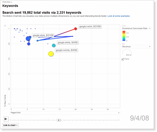
As you can see, "Google Store" is the most consistent keyword in terms of revenue and site engagement (i.e. five to eight pages/visit). It gets purchases every day, mostly on first-time visits to the store. However, it has very low conversion rates. In contrast, "google t-shirt" and "google shirts" get good conversion rates, good engagement, and deliver a regular stream of revenue.
With these facts in mind, the website owner comes away with at least three insights after quickly examining the information in this Motion Chart:
- Stop buying general keywords like "google merchandise" and "google store." Instead, optimize the site so that it ranks well organically for these keywords.
- Buy or spend more heavily on specific keywords like "google t-shirt" and "google shirt."
- Create some incentives to get repeat business. Most of these purchases come from first time visits.
And there you go! Your first experience with Motion Charts.
Working with data in five dimensions takes some time to get used to, so please experiment. Nothing can go wrong and your data will not be affected. Motion Charts are currently available in English only, but we hope to have it in all supported languages soon.
We had a lot of fun creating this feature which combines visual observation, creativity and advanced data analysis. While we built this feature, our new product manager, Beth, would come by and strum on a guitar and sing the praises of Motion Charts. So we did some experimenting ourselves, with this incredibly low-budget (but annotated:-), just-for-fun video we made of a song we wrote about Motion Charts. Brett wrote the lyrics, Alden wrote the music, and we all pitched in to the off-pitch fun. Enjoy.
Tidak ada komentar:
Posting Komentar