Tampilkan postingan dengan label css. Tampilkan semua postingan

Rabu, 18 September 2013

Rounded Corners and Shadows for Images using CSS

Here are some unique border styles that you can apply to blogger images by using the border-radius property and defining either all four corners simultaneously or applying the rounded border only to some of them.

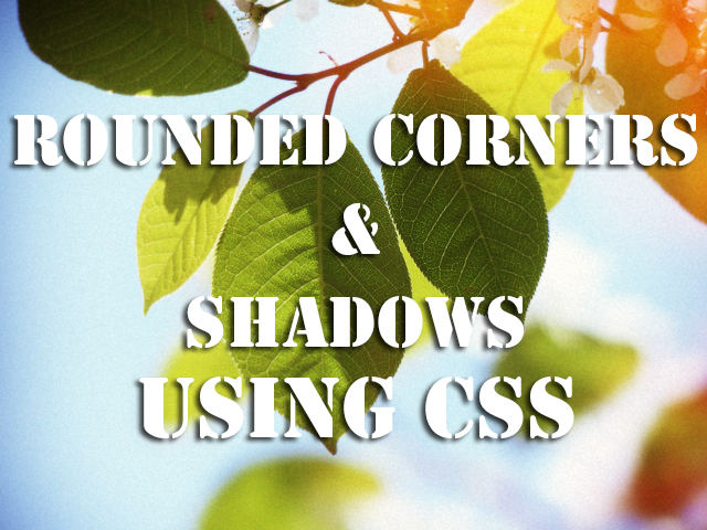
One of the advantages of CSS3 is that we can apply rounded borders without complicating things too much and one of the options would be to use these edges or borders to images in the blog posts, to which we can also add some hover effects such as shading and rounded borders accompanied by transitions.

Note: if you need more info about how to add rounded corners on images, follow these links:
- CSS Basics. How to Apply Rounded Corners On Images #1
- CSS Basics. How to Apply Rounded Corners On Images #2

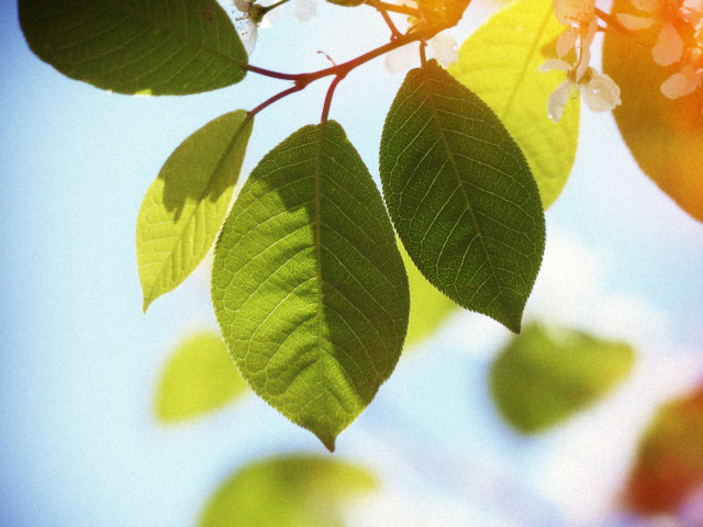
Below are a few examples of these borders and how the images behave when you hover over them.
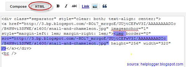
If you want to use one of these styles, just copy the code below the image, then go to Template, click on the Edit HTML button and paste that code before ]]></b:skin> (CTRL + F to find it)
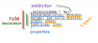
.post-body img {
border:0;
padding:0;
-moz-transition: all 1s;
-webkit-transition: all 1s;
-o-transition: all 1s;
}
.post-body img:hover {
box-shadow: 0px 0px 15px #000; /* Shadow */
border-radius: 50%; /* Rounded border */
-moz-transition: all 1s;
-webkit-transition: all 1s;
-o-transition: all 1s;
cursor:pointer;
}
.post-body img {
background:#FFF; /* background color around the image */
padding:15px; /* space between border and image */
-moz-transition: all 1s;
-webkit-transition: all 1s;
-o-transition: all 1s;
}
.post-body img:hover {
box-shadow: 0px 0px 15px #000; /* Shadow */
border-radius: 0% 50%; /* Rounded border */
-moz-transition: all 1s;
-webkit-transition: all 1s;
-o-transition: all 1s;
cursor:pointer;
}
.post-body img {
background:#FFF; /* the background color around the image */
padding:15px; /* The Space Between Border and Image */
border-radius: 50% 0; /* Rounded border */
box-shadow: 0px 0px 15px #000; /* Shadow */
-moz-transition: all 1s;
-webkit-transition: all 1s;
-o-transition: all 1s;
}
.post-body img:hover {
border-radius:0; /* This removes the border roundness (value 0) */
-moz-transition: all 1s;
-webkit-transition: all 1s;
-o-transition: all 1s;
cursor:pointer;
}
.post-body img {
box-shadow: 0px 0px 15px #000; /* Shadow */
border-radius: 50%; /* Rounded border */
border:0;
padding:0;
-moz-transition: all 1s;
-webkit-transition: all 1s;
-o-transition: all 1s;
}
.post-body img:hover {
box-shadow: 0; /* With this we remove the shadow (value 0) */
border-radius: 0; /* This removes the border roundness (value 0) */
-moz-transition: all 1s;
-webkit-transition: all 1s;
-o-transition: all 1s;
cursor:pointer;
}
.post-body img {
border-radius: 45% / 20%; /* Rounded border */
box-shadow: 0px 0px 15px #000; /* Shadow */
padding:0;
-moz-transition: all 1s;
-webkit-transition: all 1s;
-o-transition: all 1s;
}
.post-body img:hover {
border-radius: 0; /* This removes the roundness of border (value 0) */
-moz-transition: all 1s;
-webkit-transition: all 1s;
-o-transition: all 1s;
cursor:pointer;
}
So these effects will apply to all images uploaded to your Blogger posts. But if you want to apply them only on certain pictures then change .post-body img with .rounded  and .post-body img:hover with .rounded:hover
Then add the rounded class selector in the image's code:
<img class="rounded" src="Image URL"/>
These are just some examples, however, you can modify them anytime by adding or deleting more CSS styles, it depends on everybody's tastes or needs. But as you have seen, we can make the images look way more attractive and this has been done only with CSS ;)

Minggu, 02 Juni 2013

Horizontal menu with sub-tabs in two columns for Blogger

This is a very nice horizontal menu in which its sub-tabs are displayed in two columns and is also made with CSS, without any scripts.
blogger navigation menu, css menu, drop-down menu
The "advantage" so to speak, is that the sub-tabs when arranged in two columns are not very long, so it will be neat and less space along. You can see an example here:


Adding A Horizontal Menu With Sub Tabs in Two Columns To Blogger

STEP 1: In Blogger, go to your "Layout" and on the "Page Elements" section.
  • Click on the "Add a Gadget" link just under your header image
  • From the Gadget's List, select "HTML/JavaScript" option.
STEP 2: Simply copy and paste this ENTIRE code into your widget. Note: Leave the "Title" section of this widget blank.
<div id='menucol'>
<div id='topwrapper'>
<ul id='top'>
<li><a href='http://YOUR URL HERE.com'>Tab 1 Title Here</a></li>
<li><a href='http://YOUR URL HERE.com'>Tab 2 Title Here</a></li>
<li><a class='submenucol' href='#'>Tab 3 Title Here</a>
<ul>
<li><a href='http://YOUR URL HERE.com'>Sub Tab 3.1</a></li>
<li><a href='http://YOUR URL HERE.com'>Sub Tab 3.2</a></li>
<li><a href='http://YOUR URL HERE.com'>Sub Tab 3.3</a></li>
<li><a href='http://YOUR URL HERE.com'>Sub Tab 3.4</a></li>
<li><a href='http://YOUR URL HERE.com'>Sub Tab 3.5</a></li>
<li><a href='http://YOUR URL HERE.com'>Sub Tab 3.6</a></li>
</ul>
</li>
<li><a class='submenucol' href='#'>Tab 4 Title Here</a>
<ul>
<li><a href='http://YOUR URL HERE.com'>Sub Tab 4.1</a></li>
<li><a href='http://YOUR URL HERE.com'>Sub Tab 4.2</a></li>
<li><a href='http://YOUR URL HERE.com'>Sub Tab 4.3</a></li>
<li><a href='http://YOUR URL HERE.com'>Sub Tab 4.4</a></li>
<li><a href='http://YOUR URL HERE.com'>Sub Tab 4.5</a></li>
<li><a href='http://YOUR URL HERE.com'>Sub Tab 4.6</a></li>
</ul>
</li>
<li><a class='submenucol' href='#'>Tab 5 Title Here</a>
<ul>
<li><a href='http://YOUR URL HERE.com'>Sub Tab 5.1</a></li>
<li><a href='http://YOUR URL HERE.com'>Sub Tab 5.2</a></li>
<li><a href='http://YOUR URL HERE.com'>Sub Tab 5.3</a></li>
<li><a href='http://YOUR URL HERE.com'>Sub Tab 5.4</a></li>
<li><a href='http://YOUR URL HERE.com'>Sub Tab 5.5</a></li>
<li><a href='http://YOUR URL HERE.com'>Sub Tab 5.6</a></li>
<li><a href='http://YOUR URL HERE.com'>Sub Tab 5.7</a></li>
<li><a href='http://YOUR URL HERE.com'>Sub Tab 5.8</a></li>
</ul>
</li>
<li><a href='http://YOUR URL HERE.com'>Tab 6 Title Here</a></li>

</ul>
<br class='clearit'/>
</div>
</div>
Customize your main tabs by changing the Tab Titles to whatever you want. Include a URL for each one if you want it to be 'clickable'. If not, you can just put a # sign where it says http://YOUR URL HERE.com

You can add or delete as many of the main tabs as you need, just make sure to copy the entire code for the main tab for each additional tab you want:
<li><a href='http://YOUR URL HERE.com'>Tab 7 Title Here</a>
<ul>
<li><a href='http://YOUR URL HERE.com'>Sub Tab 7.1</a></li>
<li><a href='http://YOUR URL HERE.com'>Sub Tab 7.2</a></li>
<li><a href='http://YOUR URL HERE.com'>Sub Tab 7.3</a></li>
</ul>
</li>
STEP 3: Now let's go a step further and add the CSS style in our Template
  • Go to Template > Edit HTML
  • Click on the sideways arrow next to <b:skin>...</b:skin> 

  • Then click anywhere inside the code area and search - using CTRL + F keys - for the ]]></b:skin> tag and just above ]]></b:skin> add this code:
/* Horizontal menu with 2 columns
----------------------------------------------- */
#menucol {
width:940px;
height:37px;
background-image: -moz-linear-gradient(top, #666666, #000000);
background-image: -webkit-gradient(linear, left top, left bottom, color-stop(0.00, #666666), color-stop(1.0, #000000));
filter: progid:DXImageTransform.Microsoft.Gradient(gradientType=0,startColorStr=#666666,endColorStr=#000000);
border-bottom:1px solid #666666;
border-top:1px solid #666666;
margin:0 auto;padding:0 auto;
overflow:hidden;
}
#topwrapper {
width:940px;
height:40px;
margin:0 auto;
padding:0 auto;
}
.clearit {
clear: both;
height: 0;
line-height: 0.0;
font-size: 0;
}
#top {
width:100%;
}
#top, #top ul {
padding: 0;
margin: 0;
list-style: none;
}
#top a {
border-right:1px solid #333333;
text-align:left;
display: block;
text-decoration: none;
padding:10px 12px 11px;
font:bold 14px Arial;
text-transform:none;
color:#eee;
}
#top a:hover {
background:#000000;
color:#F6F6F6;
}
#top a.submenucol {
background-image: url(https://blogger.googleusercontent.com/img/b/R29vZ2xl/AVvXsEh-rRjq94BFCfuzLx6Ylq8HAO3hvUbOe91WzwnJ0ZV8WKaoG9HYTFUKpKHgB_8llh3VV8BIBgO-To2M8p40OdJnCUbFKtFkBq2YnbS8500shgyRK19FY1B66OUjjHpNRTvn8aBbbCv_wF4/s1600/arrow_white.gif);
background-repeat: no-repeat;
padding: 10px 24px 11px 12px;
background-position: right center;
}
#top li {
float: left;
position: relative;
}
#top li {
position: static !important;
width: auto;
}
#top li ul, #top ul li {
width:300px;
}
#top ul li a {
text-align:left;
padding: 6px 15px;
font-size:13px;
font-weight:normal;
text-transform:none;
font-family:Arial, sans-serif;
border:none;
}
#top li ul {
z-index:100;
position: absolute;
display: none;
background-color:#F1F1F1;
margin-left:-80px;
padding:10px 0;
border-radius: 0px 0px 6px 6px;
box-shadow:0 2px 2px rgba(0,0,0,0.6);
filter:alpha(opacity=87);
opacity:.87;
}
#top li ul li {
width:150px;
float:left;
margin:0;
padding:0;
}
#top li:hover ul, #top li.hvr ul {
display: block;
}
#top li:hover ul a, #top li.hvr ul a {
color:#333;
background-color:transparent;
text-decoration:none;
}
#top ul a:hover {
text-decoration:underline!important;
color:#444444 !important;
}
  • Now find (CTRL + F) this line:
/* Tabs
  • It will also have some little lines beneath:
/* Tabs
----------------------------------------------- */
  • And just below these little lines, delete the code below until you reach at:
/* Columns
----------------------------------------------- */
  • Instead of the code that you have removed, add this one:
#crosscol ul {z-index: 200; padding:0 !important;}
#crosscol li:hover {position:relative;}
#crosscol ul li {padding:0 !important;}
.tabs-outer {z-index:1;}
.tabs-inner {padding: 0 0px;}
See this screenshot for more info:
menu for blogger, blogger gadgets, blogger widgets
STEP 4: The final step is to Save the Template and you are done!

Visit your blog to see a beautiful navigation menu just below header.
If you have any questions or need help, leave a comment below.

Jumat, 31 Mei 2013

Multi Hover Effect On Blogger Images Using Pure CSS

Today I'm going to show you how to add an amazing mouseover effect for Blogger images using only CSS, in which moving your mouse over an image from different directions (from above, from below, etc) will cause an overlay transitioned in from the same vector. This trick will change not only the images appearance when moving mouse over them, but will also allow you to add inside a text with a description.

hover effect, mouseover, blogger hover effects

You can see the effect on this image below: try moving your mouse from the left, right, and above.

hover right hover top hover left hover bottom

Adding Hover Effect From Different Directions on Blogger Images

First thing to do is to add the CSS style to our Template:

Step 1. From Blogger Dashboard, go to Template and press the Edit HTML button


Step 2. Search for the </head> tag - to find it, click anywhere inside the code area, press CTRL + F keys and type it in the search box.


Step 3. After you found it, add the following style just above it: 
<style>
  /* The container and the image */
  div.multi-hover {
    overflow: hidden;
    position: relative;
    vertical-align: middle;
    width: 100%;
    height: 358px;
    line-height: 358px;
  }
  div.multi-hover img {width: 100%;}

/* The texts that, by default, are hidden */
  div.multi-hover span {
    color: #FFF;
    font-size: 32px;
    font-weight: bold;
    height: 100%;
    opacity: 0;
    position: absolute;
    text-align: center;
    transition: all 0.3s linear 0s;
    width: 100%;
  }

/* And this is what will generate the effect */
  div.multi-hover span:nth-child(1) { /* right */
    background: none repeat scroll 0 0 rgba(255, 189, 36, 0.6);
    left: 90%;
    top: 0;
  }
  div.multi-hover span:nth-child(2) { /* top */
    background: none repeat scroll 0 0 rgba(106, 170, 255, 0.6);
    left: 0;
    top: -80%;
  }
  div.multi-hover span:nth-child(3) { /* left */
    background: none repeat scroll 0 0 rgba(204, 87, 166, 0.6);
    left: -90%;
    top: 0;
  }
  div.multi-hover span:nth-child(4) { /* bottom */
    background: none repeat scroll 0 0  rgba(97, 181, 115, 0.6);
    left: 0;
    top: 80%;
  }

  div.multi-hover span:hover {opacity: 1;}
  div.multi-hover span:nth-child(2n+1):hover {left: 0;}
  div.multi-hover span:nth-child(2n):hover {top: 0;}

</style>
Step 4. Save the Template

Now we are going to add the HTML that is nothing but a DIV where we included four SPAN tags with texts and an image:

Step 5. Choose Posts, create a New Post, click on the HTML tab (1) and paste this code inside the empty box:
<div class=multi-hover>
  <span>hover right</span>
  <span>hover top</span>
  <span>hover left</span>
  <span>hover bottom</span>
  <img src="https://blogger.googleusercontent.com/img/b/R29vZ2xl/AVvXsEjlW726iPwnjHGb8J1mkvqKCmc8yaUmLb9-k5zmvNIn1ccSBQ6F2bD1TXTZHdXliYyF2DMMUKOOejhQ7bntqAxIiz9S5op3l3oKYBn6YB83EHiSjSTVDZDwCmpSv4MoTwhRxWxu1-G9RjI/s1600/flowers">
</div>
Add your own text/description to "hover right", "hover top", "hover left" and "hover bottom" (2) and replace the url in blue with the image URL (3) where you want to apply the effect.

Important! Do not click on the Compose tab, otherwise the changes will be lost.


Step 6. After you finished editing your post, click Publish (4)

And that's it... enjoy! :)

Sabtu, 13 April 2013

Create Horizontal Navigation Menu With Drop Down Submenus Using CSS

The following drop down menu is made only with CSS, is a horizontal menu with sub-tabs and the right side has a rounded search. A menu is handy for those who do not require complex menus or prefer not to use one that requires scripts and/or too many images, also the installation and customization is quite simple, and to top it off is quite functional.

To see this drop down menu in action, visit this demo blog

blogger menu, drop down menu, css menu

Prior to doing anything, if you are using a Template made through Blogger Template Designer, then you should consider doing these changes in the template, otherwise the menu might not be displayed correctly:

From your Blogger's Dashboard, go to Template (make a backup < see the screenshot) > Edit HTML:


and search (CTRL + F) for the following line:

<b:section class='tabs' id='crosscol' maxwidgets='1' showaddelement='yes'>

Screenshot

Remove the code in red.
You may have many parts as the one in red, delete all you find.

....then find this section in your template:
/* Tabs
----------------------------------------------- */

...and remove all that is within it, until you reach to the Headings part.

/* Tabs
----------------------------------------------- */
.tabs-outer {
overflow: hidden;
position: relative;
background: $(tabs.background.color) $(tabs.background.gradient) repeat scroll 0 0;
}

#layout .tabs-outer {
overflow: visible;
}

.tabs-cap-top, .tabs-cap-bottom {
position: absolute;
width: 100%;

border-top: 1px solid $(tabs.border.color);

}

.tabs-cap-bottom {
bottom: 0;
}

.tabs-inner .widget li a {
display: inline-block;

margin: 0;
padding: .6em 1.5em;

font: $(tabs.font);
color: $(tabs.text.color);

border-top: 1px solid $(tabs.border.color);
border-bottom: 1px solid $(tabs.border.color);
border-$startSide: 1px solid $(tabs.border.color);
}

.tabs-inner .widget li:last-child a {
border-$endSide: 1px solid $(tabs.border.color);
}

.tabs-inner .widget li.selected a, .tabs-inner .widget li a:hover {
background: $(tabs.selected.background.color) $(tabs.background.gradient) repeat-x scroll 0 -100px;
color: $(tabs.selected.text.color);
}

/* Headings
----------------------------------------------- */

Then add this to where the code has been removed (instead of the code in green):
#crosscol ul {z-index: 200; padding:0 !important;}
#crosscol li:hover {position:relative;}
#crosscol ul li {padding:0 !important;}
.tabs-outer {z-index:1;}
.tabs .widget ul, .tabs .widget ul {overflow: visible;}
Having done this, we can finally add our menu.

How To Add Horizontal Drop Down Menu to Blogger

To put this horizontal menu with submenus in your blog, then follow the next steps:

Step 1. From Template, go to Edit HTML and just above ]]></b:skin> paste these styles:
/* Horizontal drop down menu
----------------------------------------------- */
#menuWrapper {
width:100%; /* Menu width */
height:35px;
padding-left:14px;
background:#333; /* Background color */
border-radius: 10px; 
}
.menu {
padding:0;
margin:0;
list-style:none;
height:35px;
position:relative;
z-index:5;
font-family:arial, verdana, sans-serif;
}
.menu li:hover li a {
background:none;
}
.menu li.top {display:block; float:left;}
.menu li a.top_link {
display:block;
float:left;
height:35px;
line-height:34px;
color:#ccc;
text-decoration:none;
font-family:"Verdana", sans-serif;
font-size:12px; /* Font size */
font-weight:bold;
padding:0 0 0 12px;
cursor:pointer;
}
.menu li a.top_link span {
float:left;
display:block;
padding:0 24px 0 12px;
height:35px;
}
.menu li a.top_link span.down {
float:left;
display:block;
padding:0 24px 0 12px;
height:35px;
}
.menu li a.top_link:hover, .menu li:hover > a.top_link {color:#fff; }
.menu li:hover {position:relative; z-index:2;}
.menu ul,
.menu li:hover ul ul,
.menu li:hover ul li:hover ul ul,
.menu li:hover ul li:hover ul li:hover ul ul,
.menu li:hover ul li:hover ul li:hover ul li:hover ul ul
{position:absolute; left:-9999px; top:-9999px; width:0; height:0; margin:0; padding:0; list-style:none;}

.menu li:hover ul.sub {
left:0;
top:35px;
background:#333; /* Submenu background color */
padding:3px;
white-space:nowrap;
width:200px;
height:auto;
z-index:3;
}
.menu li:hover ul.sub li {
display:block;
height:30px;
position:relative;
float:left;
width:200px;
font-weight:normal;
}
.menu li:hover ul.sub li a{
display:block;
height:30px;
width:200px;
line-height:30px;
text-indent:5px;
color:#ccc;
text-decoration:none;
}
.menu li ul.sub li a.fly {
/* Submenu Background Color */
background:#333 url(https://blogger.googleusercontent.com/img/b/R29vZ2xl/AVvXsEgvv7nLoc8AolKSeKOQwLNFqCk0kNyYX5UUppplRc8Udph2WudHLQitKYsxtpypU4SRD_jHi0No0gyUvIXYa7KkJdhDKlnar4O99bzOxtZ12lBJf6auluGMCLAipoX66TNzox1rcPb_lVs/s1600/arrow_over.gif) 185px 10px no-repeat;}
.menu li:hover ul.sub li a:hover {
background:#515151; /* Background Color on mouseover */
color:#fff;
}
.menu li:hover ul.sub li a.fly:hover, .menu li:hover ul li:hover > a.fly {
/* Background on Mouseover */
background:#646464 url(https://blogger.googleusercontent.com/img/b/R29vZ2xl/AVvXsEgvv7nLoc8AolKSeKOQwLNFqCk0kNyYX5UUppplRc8Udph2WudHLQitKYsxtpypU4SRD_jHi0No0gyUvIXYa7KkJdhDKlnar4O99bzOxtZ12lBJf6auluGMCLAipoX66TNzox1rcPb_lVs/s1600/arrow_over.gif) 185px 10px no-repeat; color:#fff;}

.menu li:hover ul li:hover ul,
.menu li:hover ul li:hover ul li:hover ul,
.menu li:hover ul li:hover ul li:hover ul li:hover ul,
.menu li:hover ul li:hover ul li:hover ul li:hover ul li:hover ul {
left:200px;
top:-4px;
background: #333; /* Background Color of the Submenu */
padding:3px;
white-space:nowrap;
width:200px;
z-index:4;
height:auto;
}
#search {
width: 228px; /* Width of the Search Box */
height: 50px;
float: right;
z-index: 2;
text-align: center;
margin-top: 5px;
margin-right: 6px;
/* Background of the Search Box */
background: url(https://blogger.googleusercontent.com/img/b/R29vZ2xl/AVvXsEj8rhyphenhyphent3PgOb3gySAneHZYQGWJgu9lGfsNx9ad5d0JTxTD6X-o7HUF9Em7_vB7sdRAoTqOoW-GF_fT5tKcrvBiYGt_8Xx82yFN7x4f-_0OH6dZ-d5O3N2sB8kUpxkso4DUA1WySWBPVpts/s1600/searchBar1.png) no-repeat;
}
#search-box {
margin-top: 3px;
border:0px;
background: transparent;
text-align:center;
}


Screenshot
Step 2. Save the Template


Step 3. Go to Layout > click on Add a Gadget link


Step 4. Choose HTML/Javascript and paste the following inside the empty box:

<div id='menuWrapper'>
<ul class='menu'>
<li class='top'><a class='top_link' href='Link URL'><span>Title 1</span></a></li>

<li class='top'><a class='top_link' href='Link URL'><span class='down'>Title 2</span></a><ul class='sub'><li><a class='fly' href='Link URL'>Submenu 2.1</a><ul>
<li><a href='Link URL'>Submenu 2.1.1</a></li>
<li><a href='Link URL'>Submenu 2.1.2</a></li>
<li><a href='Link URL'>Submenu 2.1.3</a></li>
</ul>
</li>
<li class='mid'><a class='fly' href='Link URL'>Submenu 2.2</a>
<ul>
<li><a href='Link URL'>Submenu 2.2.1</a></li>
<li><a href='Link URL'>Submenu 2.2.2</a></li>
<li><a href='Link URL'>Submenu 2.2.3</a></li>
<li><a class='fly' href='Link URL'>Submenu 2.2.4</a>
<ul>
<li><a href='Link URL'>Submenu 2.2.4.1</a></li>
<li><a href='Link URL'>Submenu 2.2.4.2</a></li>
<li><a href='Link URL'>Submenu 2.2.4.3</a></li>
</ul>
</li>
<li><a href='Link URL'>Submenu 2.2.5</a></li>
<li><a class='fly' href='Link URL'>Submenu 2.2.6</a>
<ul>
<li><a href='Link URL'>Submenu 2.2.6.1</a></li>
<li><a href='Link URL'>Submenu 2.2.6.2</a></li>
</ul>
</li>
</ul>
</li>
<li><a href='Link URL'>Submenu 2.3</a></li>
<li><a href='Link URL'>Submenu 2.4</a></li>
<li><a href='Link URL'>Submenu 2.5</a></li>
</ul>
</li>

<li class='top'><a class='top_link' href='Link URL'><span class='down'>Title 3</span></a>
<ul class='sub'>
<li><a href='Link URL'>Submenu 3.1</a></li>
<li><a href='Link URL'>Submenu 3.2</a></li>
<li><a href='Link URL'>Submenu 3.3</a></li>
<li><a href='Link URL'>Submenu 3.4</a></li>
</ul>
</li>

<li class='top'><a class='top_link' href='Link URL'><span class='down'>Title 4</span></a>
<ul class='sub'>
<li><a href='Link URL'>Submenu 4.1</a></li>
<li><a class='fly' href='Link URL'>Submenu 4.2</a>
<ul>
<li><a href='Link URL'>Submenu 4.2.1</a></li>
<li><a href='Link URL'>Submenu 4.2.2</a></li>
<li><a href='Link URL'>Submenu 4.2.3</a></li>
<li><a href='Link URL'>Submenu 4.2.4</a></li>
<li><a href='Link URL'>Submenu 4.2.5</a></li>
<li><a href='Link URL'>Submenu 4.2.6</a></li>
</ul>
</li>
<li><a href='Link URL'>Submenu 4.3</a></li>
<li><a href='Link URL'>Submenu 4.4</a></li>
<li><a href='Link URL'>Submenu 4.5</a></li>
<li><a href='Link URL'>Submenu 4.6</a></li>
</ul>
</li>

<li class='top'><a class='top_link' href='Link URL'><span class='down'>Title 5</span></a>
<ul class='sub'>
<li><a href='Link URL'>Submenu 5.1</a></li>
<li><a href='Link URL'>Submenu 5.2</a></li>
<li><a href='Link URL'>Submenu 5.3</a></li>
</ul>
</li>


<!-- Search Bar -->
<li>
<form action='/search' id='search' method='get' name='searchForm' style='display:inline;'>
<input id='search-box' name='q' onblur='if (this.value == &quot;&quot;) this.value = &quot;Search here...&quot;;' onfocus='if (this.value == &quot;Search here...&quot;) this.value = &quot;&quot;;' size='28' type='text' value='Search here...'/></form>
</li>

</ul>
</div>

Customization:

- replace the text in blue and red with your links and titles.
- if you need more tabs, then add a line like this just above <!-- Search Bar -->

<li class="top"><a href="Link URL" class="top_link"><span>Title</span></a></li>

- if you want to add a tab with sub-tabs, then add this code:

<li class="top"><a href="Link URL" class="top_link"><span class="down">Title</span></a>
<ul class="sub">
<li><a href="Link URL">Submenu Title</a></li>
</ul>
</li>

- and if you want one of the other sub-tabs have sub-tabs then remove a line like the one in orange and change it to a code like this:

<li><a href="Link URL" class="fly">Submenu Title</a>
<ul>
<li><a href="Link URL">Other Submenu</a></li>
</ul>
</li>

And that's it! Now Save your Widget and enjoy your new drop down menu! ;)

Selasa, 19 Maret 2013

CSS Basics. How to Apply Rounded Corners On Images #2

blogger tricks, css tricks, border radiusIn the previous post I have mentioned that we will learn to round images using CSS, without needing to edit them one by one using a program. Now that we have seen the basics of CSS, let's try to apply to some images.

What we will do is to upload an image as normal (HTML) and then add some rules in our style sheet that will transform the outer shape as a circle... or at least to appear round. This will depend on the proportions of image that we use.

In fact, we can apply this effect to any image, to all of an area or to all in our blog. That depends on your tastes.

Marking up HTML

Obviously the first thing we need for in order to round an image is an idem. The code could be more complicated, but an image is built within the img tag and basically looks like this:

<img src="image_URL"/>

Screenshot:


This is how we make it look something like the one from the left. Normally, it should also keep an alt text and sometimes it carries some forced dimensions (with width and/or height). When you upload an image, the code inside the Blogger editor also contains a link that is pointing to the original image.

But if we want to modify this image using CSS, we need to incorporate a class selector. We can add it in two ways: within the img tag or to a parent box. The name that I have chosen for the selector is roundedcorners:

<img class="roundedcorners" src="image_URL"/>


<div class="roundedcorners">
<img src="image_URL"/>
</div>


Applying style to all homogeneous elements

But that selector alone will do nothing. It needs to be linked to a style rule that tells what to do with it. As much as we add classes, if these are not defined in the CSS, the appearance of the image (or a certain element) will not change.

To change the shape of all the images on our blog, this would be what we should add to our CSS:

img {
border: 2px solid #BADA55;
margin: 0;
padding: 0;
border-radius: 900px;
-moz-border-radius: 900px;
}

And how it translates to your browser? As follows:

Search for images by name tag (img) and apply the following style:
  • a solid green border of 2 pixels
  • margins (space outside the border) and padding (space inside the border) is set to zero
  • the image is round at the four corners

Now that we have this rule in our style sheet itself, we can see the picture as we wanted - see the example on the right.

To declare a property correctly, we need to know what it does and how to write and you can find more info in many places, although W3C is the authority in this.

For example border-radius requires initially 4 values reading from left to right that represent the roundness of the upper-left, upper-right, lower-right and lower-left corner. If you put a single value is understood that all four will be equal to that.

You should also know that when the value of the border exceeds the dimensions of the box, this border is adapted to form a circle.

How to Apply Style to the Elements of the Same Block

But surely we do not want all the blog images to be round, but only those that we choose, otherwise adding the above style in the head tag will make all of our blog images to take this shape. Before we used an HTML tag (img) and not a selector and that is why the style will affect all images.

To avoid this, we can do one of the things we saw at the beginning and that was to put the image inside a div with the roundedcorners class. In this way, only the images that are in a box with that class will be affected by the rule that will make them round.

<div class="roundedcorners"><img src="image_URL"/></div>

But the rule then should not attack the img tag directly, but the roundedcorners selector. In this case, you should write it like this:

.roundedcorners img {
border: 2px solid #BADA55;
....
}

This means that this style applies only to images that are in a box with roundedcorners class.

Epilogue

To close the subtopic of rounding images, you have to keep in mind that if these are not square, instead of becoming circular, they will look oval.


To fix this we should add the width and height with the same measure (value in pixels), that is to force the image cropping and to make it appear perfectly circular. That was all!

If you enjoy reading this blog, please share and subscribe. For any questions, drop a comment below ;)

Senin, 18 Maret 2013

CSS Basics. How to Apply Rounded Corners On Images #1

This tutorial will explain how to change the outside border of any image using some simple CSS rules to make it round, but this is so easy to do, that I'm finally going to make this entry for other purposes.
rounded corners, css tricks, blogger tricks, blogger design
The trick today that I'm going to publish in two parts is to help to understand at least a little of what CSS (Cascading Style Sheets) is. But very briefly that I'm not able to do a good comprehensive manual on the subject. For those who want to see a bit more, take a look at this link and for those who really want to learn thoroughly, I recommend to visit this site.

Introduction and terminology

Style sheets aim to help sort out what is the structure of a website and which is its format, its appearance. Thus, the CSS box model is essentially a box that wraps around HTML elements, and it dictates how those boxes are presented in terms of colors, fonts, width, backgrounds etc.

The advantage is that if in the future we decide to change something, we don't have to change all the pages one by one, but simply change the properties of one kind or another box from the style sheet and these changes will automatically apply in all the pages.

The style sheet is a set of rules, in turn composed of selectors and declarations. The selector is to be used as a nickname or name of what you want to configure from the sheet and apply to the HTML and declarations are properties that are assigned to the desired values ​​(more information on CSS syntax)

Adding the CSS selector

Once we put for example the one above in our style sheet, we see that in our website... nothing happens. I said that the selector is what relates HTML and CSS so that if we want a box to take these values ​​for width, background color, border and font size (that's what we defined earlier), we need to include the selector, thus:

<div class="SelectorName">Text here</div>

What we have added is a rule that tells the browser to interpret that this box has to be of a certain type or class. A class that was mentioned earlier is called selector having some specific properties and values ​​defined in the style sheet.

Now we'll see how this will change the look of the box, while all others that don't have the SelectorName  name will follow the standard appearance.

Therefore, when we include a rule in a style sheet, or modify an existing one, what happens is that all boxes marked with that selector will change their appearance according to the properties-values ​​that we have defined.

On the contrary, if we want that an unmarked box to change its appearance with the CSS rules defined, we'll add the appropriate selector.

Where to add the CSS style

The style can be put in a CSS file. The file is created with all the rules, you get the address and then include the following line in the header of your template. For Blogger, you can add it between <head> and <b:skin><![CDATA[/*:

<link href="syle.css" rel="stylesheet" type="text/css"/>

Note: in blue is where the address of your CSS file should be added.

You can also add the style directly mixed with HTML, inserted between the style tags:

<style>
.SelectorName {
background-color: #EAEAEA;
border: 1px solid #444444;
width: 200px;
font-size: 12px;
}
</style>

It can be inserted into a particular box, as well. In this case, you do not need to add any selector to indicate where the CSS style is:

<div style="background-color: #EAEAEA; border: 1px solid #444444; width: 200px; font-size: 12px;">Text here</div>

In Blogger the rules are between the skin tags, which means they are between <b:skin><![CDATA[/* and ]]></b:skin>. If you edit the template, will find that there are many things in between. All this is CSS that marks the appearance of your blog.

In case we want to see the effect after changing the value of some propriety, we can click on the Preview button. We can also remove anytime a declaration or add another to the desired selector.

For those who don't want to touch the template, you can add the CSS directly by going to the Advanced section > Add CSS of your Template Designer.


That's enough for today. The next tutorial will discuss in more detail about how to add rounded corners to our images using CSS.

Selasa, 16 Maret 2010

Bokeh Effect : Tutorials Examples + CSS3

Inspirational Examples of the Bokeh Effect

“In photography, bokeh is the blur, or the aesthetic quality of the blur, in out-of-focus areas of an image, or “the way the lens renders out-of-focus points of light.” Differences in lens aberrations and aperture shape cause some lens designs to blur the image in a way that is pleasing to the eye, while others produce blurring that is unpleasant or distracting— “good” or “bad” bokeh, respectively.


Bokeh Effect in Web Design: Showcase, Tutorials and Resources

In this article you will find inspirational showcase of beautiful and very colorful websites with bokeh effect. Also you’ll be able to learn different bokeh effect techniques by checking listed useful and detailed tutorials. For the conclusion you will find a lot of great bokeh resources.


Pure CSS3 bokeh effect with some jQuery help

Today, I want to add another addition to the bokeh "hype", by creating a pure CSS3 bokeh effect. With some help from jQuery, we can add some randomness in colour, size and position for the effect.


50 Examples and Tutorials of Bokeh in Photography, Textures and Websites

Bokeh, a style originally from Japan that describes an out of focus area of a image/photograph that is used to draw your eye to the subject of the image. This extremely popular photography technique creates surreal and beautiful images, either naturally or using programs like Photoshop. The light and tonal patterns created are often very unique, giving the image or design an extra added depth.


Kamis, 11 Maret 2010

CSS3 : 250 High Quality CSS3 Tutorials And Resources

33 Must Read CSS3 Tips, Tricks, Tutorial Sites and Articles


Since previous article about CSS text effects got really big attention I decided to research and find more interesting articles and websites just focused on CSS3, teaching you how to use it, showing pros and cons and much more. To be honest it’s hard for me to keep up with technologies myself, but we really cannot not to use those new great selectors to make our designs even more beautiful, user-friendly and lightweighted. However since HTML5 is sort of tied with CSS3, I will soon continue with HTML5 article as well, so don’t miss it and keep coming back! Enjoy!


25 Useful CSS3 Techniques and Tutorials


It is essential today for a web designer to know about CSS3 and there are many tutorials and resources for the CSS3. Below i’ve listed 25 Useful CSS3 Techniques and Tutorials to get you started with CSS3, hope you find this collection useful


A CSS3 Tutorial - Features, Techniques, Tips, Tricks


The genesis of the Cascading style sheets began 13 years ago and the widely adopted CSS 2.1 standard has existed for 11 years now. The world is changing fast with its technology and when we look at the so called ‘ancient websites’ that has just completed a decade we find a wide difference in the World Wide Web.


CSS3 Techniques You Should Know


Many of you have probably heard all the buzz around CSS3, but exactly which techniques can we use today? In this article I’ll show you some different CSS3 techniques that work great in some of the leading browsers (i.e. Firefox, Chrome, Safari, Opera ), and how they will degrade well in the non-supported browsers (i.e. Internet Explorer). Using browser specific extensions, many of the proposed CSS3 styles can be used today!


70 Must-Have CSS3 and HTML5 Tutorials and Resources


CSS3 and HTML 5 are capable of revolutionizing the way we design websites. Both include so many new features and functions that it can be hard to wrap your head around them at times. The inclusion of native support for things like rounded corners and multi-column layouts are just the tip of the ice berg.


60 Excellent CSS3 Tutorials and Techniques You Should Know


In this post we present 60 Excellent CSS3 Tutorials and Techniques You Should Know that can strongly improve user experience, improve designer’s work-flow and replace dirty old workarounds that we used in Internet Explorer 6 & Co. Please notice that most techniques and tutorials presented below are experimental, and its good to have place at one post.


20 CSS3 Tutorials and Techiques for Creating Buttons


In May last year we published an article entitled 22 CSS Button Styling Tutorials and Techniques, it proved to be pretty popular, and the most amazing thing about that post is that none of the tutorials even touch on the subject of CSS3.. What a difference a year makes!


20 Must Know Recent CSS and CSS3 Resources and Tools


CSS is always the easiest method to improve websites design and functionality. Moreover, The next version of CSS (CSS3) will revolutionize the way websites works. Except Internet Explorer most of the modern browsers supports CSS3 features. Here we present to you 20 recent CSS & CSS3 tools and resources you need to be aware of as a web designer/developer.


Rabu, 10 Maret 2010

50 CSS Tools:Frameworks Generators Ads-Ons

19 Popular CSS Tools For Web Developers and Designers


Today we have collected 19 popular CSS tools, which will make your life easier. Don’t forget we are here to help our design community, if i missed any good tool don’t hesitate to tell us.


20 Must Know Recent CSS and CSS3 Resources and Tools


CSS is always the easiest method to improve websites design and functionality. Moreover, The next version of CSS (CSS3) will revolutionize the way websites works. Except Internet Explorer most of the modern browsers supports CSS3 features. Here we present to you 20 recent CSS & CSS3 tools and resources you need to be aware of as a web designer/developer.


12 really useful CSS tools


Working on a website’s CSS is quite an enjoyable job. However some of the tasks aren’t always fun. This is why tons of cool CSS tools were created, to make your life easier and keep web designers’ work barable.


15 Useful Firefox Add-Ons To Make CSS Developers Lives Easier


We give you the 15 Firefox addons that a CSS developer should think twice before uninstalling because they will make your life as a CSS Developer much easier..


Rabu, 03 Maret 2010

15 Breathtaking Examples Of CSS Sprite Technique

The basic of CSS Sprites is to jam all your icons in one big image to reduce the number of image requests. This is an advantage when the little requests combined are a bigger hit in bandwidth then one big image. Also, since some browsers have very limited capabilities in the field of concurrent HTTP requests, i.e., downloading more than 2 files at once, a few dozen images waiting in the queue can certainly make your visitors think your site is slow, even if that is not true “in reality”.

Envira Media


Envira Media


Explovent


Explovent


Explovent sprite


Sexy Bookmarks


Sexy Bookmarks


Sexy Bookmarks sprite


Loodo


Cassys Design


Design Disease


Web Designer Wall


Kevin John Gomez


Kupferwerk


Oink


qrayg


ronnypries


Klei Entertainment


Apple


CSS-Tricks