1. Johnny Lee wowed the TED crowd when he showed how he can use a Wii Remote to make a cheap interactive Whiteboard (this video doesn't seem to be playing right now--try this link). Please create a website (InLit: HTML, Web 2/3: Dreamweaver) that does the following:
Embed the TED video.
Includes a short moviemaker video or Flash video about the other possible uses for the Wii remote that you create.
Create a table that lists the parts needed and their approximate cost.
Links to more information. Use google to search effectively.
A basic description of how it is done.
Demonstrate basic web design concepts (usability, accessibility, etc...).
2. I like this website about Thanksgiving. Can you explain Thanksgiving to someone who has never visited America or heard of the holiday? Please create a website (InLit: HTML, Web 2/3: Dreamweaver) that does the following:
Includes a short moviemaker video or Flash video about the holiday that you create.
Create a table that lists the most common foods served at the Thanksgiving meal.
Links to more information. Use google to search effectively.
Demonstrate basic web design concepts (usability, accessibility, etc...).
3. Is a soccer ball heavier when it is cold out? Does it just feel heavier? Can you kick it as far when it is cold? Please create a website (InLit: HTML, Web 2/3: Dreamweaver) that does the following:
Includes a short moviemaker video or Flash video about this that you create. Describe the basic physical laws involved.
Create a table that outlines the effect of temperature on the soccer ball. (experiment??)
Links to more information. Use google to search effectively.
Demonstrate basic web design concepts (usability, accessibility, etc...).
Things to think about:
1. How will you set up the page (multiple pages, layout, colors, etc...)?
2. How will you make it look modern?
3. How will you utilize sound and video effectively?
4. How will you ensure visitors to your site understand your message?
5. Are there tools we have used that might be effective for this? Take a moment and look back through your bookmarks or this blog. Are you bookmarking "cool sites"???
Congratulations to Kevin T for winning the Fireworks contest. I posted my Top 4 at the Parent Conference last night. One comment about this took it over the top: "I can feel his pain". That won it for me.
All of the top 4 got many votes. Each entry was very different. One person would say "I like it because its so simple and straight forward". The next would say "Its too simple and straightforward". That spoke to what a challenge design can be. You can't please everybody.
Today we will spend the day reading, listening, and possibly viewing stories about Veterans Day. Be absolutely sure you complete the blog reflection. Learn something new today.
1. First, read this article about Veterans Day from the New York Times. This is an international holiday. The differences between countries and the reasons behind the different celebrations are fascinating.
2. Second, spend some significant time in The War from PBS. Notice how this website is used, not read. This is where I expect you to spend most of your day. Put on your headphones.
3. If you have Veterans in your Geni family tree be sure to note that on their page. If you aren't sure of their service be sure to ask when you get home.
4. We have hundreds of thousands of men and woman who are new veterans. Take a moment to check out their story. Here is another reminder about the trials some of them face. Let us also remember that we have a growing total of female veterans.
5. Write a short blog post linking to one of these websites. Choose one of the following questions:
What story/website made the most impact on you? Why? Include link.
Which website was set up most effectively? Why? Include link.
That's right, all existing accounts now have access to several of the new enterprise-class features including Advanced Segmentation, Custom Reporting, Motion Charts, and the updated UI. (If your account is brand new, you may still have a short wait before you see these features. Also, the updated administration interface will be available in all accounts soon so keep an eye out for that, and the AdSense integration and API are still in private beta. We'll keep you updated on those launches here as well.)
Over the next few weeks, we'll look at each new feature in detail. First up: Motion Charts! The Motion Charts video was briefly one of the top 15 most viral videos on YouTube, so this seems to be a good place to start.
You've probably noticed the new button at the top of many reports. Clicking Visualize activates Motion Charts for the report data. You can click the Play button at the bottom to see an over-time animation of your data, but you'll first probably want to experiment with your X and Y axis settings, and the color and size of the dots. You can revert back to your original report view, so don't worry about messing anything up.
So, what are Motion Charts?
Motion Charts provide a multi-dimensional, over-time analysis of the data in your report. So, if you click Visualize from the Keywords report, each dot will represent one of your keywords. If you click Visualize from the Referrals report, each dot will represent a referral. By selecting metrics to be represented on the X and Y axis and by the size and color of the dots, you plot each dot in four dimensions. Press Play or drag the slider at the bottom of the chart, and you'll see the data change over time, thereby adding Time as the fifth dimension.
(For developers: Motion Charts use the Trendalyzer Flash widget, which is available for you to use as a gadget in Google Spreadsheets or as a visualization API.)
What can Motion Charts add to my analysis?
The basic premise of Motion Charts is that it makes it easier to notice an important trend. Visualizing data across five dimensions can help you to uncover insights and patterns that would be difficult to discover using traditional two dimensional charts. For example, looking at the traditional keyword report, it's difficult to see how performance metrics pertaining to keywords combine, interact, and change over time.
You might want to find out, for example, over the past three months, which of the top keywords you're buying are sending new visitors that are highly engaged with the site. And you might want to compare those keywords to ones which are sending visitors that bounced consistently. And importantly, you want to know when exactly keywords shift into these patterns. With a Motion Chart, you can identify the keywords (or any metric) that perform well across multiple dimensions, such as conversions, repeat visitors, and pageviews. You can plot a few things or hundreds of things at once and watch for patterns or outliers as their performance over time is animated. And you can pause and manually rewind or go forward at any time.
Once you notice a pattern or a break in pattern - such as related to a keyword's performance - and when the pattern happened, that's when the investigation begins. You can look at your reports to analyze the origins of the traffic, and then replicate conditions that caused a beneficial pattern, or instead make needed improvements. In this sense, a Motion Chart shows a richer picture of your data that you may be able to profit from.
How do I use Motion Charts?
Each dimension, or metric, can be selected easily with drop down menus around the chart's graph area. There are four metrics:
Click the "Visualize" icon from any report that has a table displaying segmented data (you can always revert to the traditional graphs in your Analytics Reports by selecting a particular report from the lefthand side menu).
Once the Motion Chart loads, you'll see an array of bubbles. Each bubble represents a different keyword from your report.
Now select the four different dimensions to plot your data:X-axis, Y-axis, Color, Size. Click on each control to see a menu of metrics you can select from. The X-axis control is underneath the graph area, the Y-axis is to the left, and the Color and Size controls are to the right of the graph area. Let's look at one of these controls to give you the hang of modifying the chart.
The Y-axis control is noted on the left in the screenshot below.
Once you click on any part of this vertical bar, it will expand to show you the variables you can choose from for the Y-Axis. Here is the expanded area, with the rest of the graph grayed out:
Pageviews is being selected. Now, obviously, the higher up a bubble (denoting a keyword in this case) is in the chart, the more the average pageviews for that bubble. You select the other variables in the same way - just click them and select your choice.
Press "Play" at the bottom of your chart to see how your keywords perform over time. If you click on a bubble and check the "Trails" box underneath the Size control, you can map out the bubble's movement over time.
Take a look at the following video - it examines each component of this feature so that you can learn how to get at-a-glance insights from the data you're seeing.
Let's look at an example: keywords with high or low conversion rates. (This example and more are also in this help center article.) We'll finish this example with action-oriented insights you can take away from a Motion Chart.
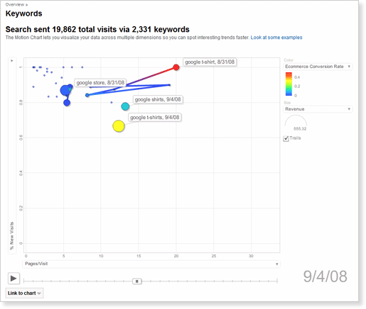
The data is taken from a Google Analytics account that tracks the e-commerce activity for the business called 'Google Store' (www.googlestore.com). We'll look at a Motion Chart on keywords by clicking "Visualize" on the Keywords report under Traffic Sources. In order to find keywords that have the best conversion rates, we would set up our Motion Chart like this:
X axis: select "Pages/Visit
Y axis: select "% New Visits"
Size: select "Revenue"
Color: select "E-commerce Conversion Rate"
As you can see, "Google Store" is the most consistent keyword in terms of revenue and site engagement (i.e. five to eight pages/visit). It gets purchases every day, mostly on first-time visits to the store. However, it has very low conversion rates. In contrast, "google t-shirt" and "google shirts" get good conversion rates, good engagement, and deliver a regular stream of revenue.
With these facts in mind, the website owner comes away with at least three insights after quickly examining the information in this Motion Chart:
Stop buying general keywords like "google merchandise" and "google store." Instead, optimize the site so that it ranks well organically for these keywords.
Buy or spend more heavily on specific keywords like "google t-shirt" and "google shirt."
Create some incentives to get repeat business. Most of these purchases come from first time visits.
And there you go! Your first experience with Motion Charts.
Working with data in five dimensions takes some time to get used to, so please experiment. Nothing can go wrong and your data will not be affected. Motion Charts are currently available in English only, but we hope to have it in all supported languages soon.
We had a lot of fun creating this feature which combines visual observation, creativity and advanced data analysis. While we built this feature, our new product manager, Beth, would come by and strum on a guitar and sing the praises of Motion Charts. So we did some experimenting ourselves, with this incredibly low-budget (but annotated:-), just-for-fun video we made of a song we wrote about Motion Charts. Brett wrote the lyrics, Alden wrote the music, and we all pitched in to the off-pitch fun. Enjoy.
The armistice treaty ending the "Great War" was signed on November 11, 1918. It is said that throughout the world nobody had seen so much rejoicing. The world had just experienced unimaginable turmoil, suffering, and pain. The following year Armistice Day was established on November 11. President Woodrow Wilson said:
To us in America, the reflections of Armistice Day will be filled with solemn pride in the heroism of those who died in the country's service and with gratitude for the victory, both because of the thing from which it has freed us and because of the opportunity it has given America to show her sympathy with peace and justice in the councils of the nation.
It was a tradition for many years that at 11am on Armistice Day that all traffic would stop, conversations cease, and all focus be made on remembering those who had sacrificed.
In 1953, in Kansas, a town observed "Veterans Day". They felt this paid tribute to the veterans who had served in World War II and the Korean War. While there was much optimism in the country at the time there was also an incredible need to remember those who had served and sacrificed. Vast amounts of men had not come home from these wars.
Congress thought this was a great idea and in 1954 made Veterans Day a national holiday.
Many of you have friends, brothers, sister, fathers, or mothers who have served. If you have a story about them you want to tell please do so today.
Here is the Fireworks contest. All classes are eligible for this contest. Winner will be posted on this blog on November 11. An example from our Memorial Day contest is seen here (you can see more in the UDrive).
Your assignment is to make a poster about Veterans Day.
Be sure you understand the purpose of Veterans Day before tackling this assignment.
Your assignment is to design an image that could be posted in schools. You will use Fireworks and choose the appropriate tool or tools for your image.
Assignment parameters:
1. You set up the image size when you create a new document: Height=300 pixels, Width =600 pixels.
2. Your images MUST be non-copyrighted. I will publish this!!
3. You must be able to defend your choice of a tool in your blog post.
4. You must include "Veterans Day" somewhere in your image. You might decide to include additional text (date, slogan, etc..).
5. You must finish by the end of the period on Monday November 10.
6. Save in Udrive when done (bschneider) as a .jpg file. All students will save in the same folder so be sure you name it correctly in the WDrive BEFORE you copy it to the UDrive. Be sure to test your work in the UDrive.
7. Hint: Interpolation allows you to blend images.
1. Take 10 minutes and look through the Election Day assignments in the Udrive. Check out each class (InLit-Web2-Web3).
2. I will grade that your Google Reader is subscribed to my podcast, this blog, and two of your friends blogs today (at least). If you still aren't sure how to do this find a partner.
3. Then--tutorial time. Your choice. Use today to fill in a gap in HTML, Fireworks, or Flash. Check the links on the right side of this page or check back in the posts. Show me your product when done.
Tomorrow we will start our traditional Veterans Day Fireworks assignment.
Just found this idea from David Pogue. How many of you want one?
Today's assignment is to report the election results. You must:
--Complete the assignment today. Just like the newspaper or TV you are working on a deadline!!!! --Be as very unbiased as possible. Be ethical and appropriate. --Report the basics (who, what, where, when, how). --Include image and/or interactive tool (Flash, Voki, Movie) that you create. Obtain images only through Creative Commons search or create them yourself.
I was really impressed with all the work you did for your exams. Everybody showed me some interesting things. Many of us realized some limits in our Flash knowledge (esp. me!) and we worked together to try and solve these issues. Good job!
Everyone has to do #1, 2, 3 today. The rest is for the remainder of time or at home for fun. This is a reading/writing/thinking week.
1. Please answer the following questions on your blog. Keep each answer short (3-4 lines at most).
What have you learned so far? Has your view of the internet changed?
Who has the best project in the UDrive? Why?
What do you think is your strength in this class (collaborating, design, Google, writing, etc...)? What is your weakness?
What is the coolest site or program you've seen since we started? Provide link!
2. If there is any "clean-up" in the UDrive to do, come back and see me.
3. On the white board you see a list of 34 items we have covered. Is there anything I am missing??? If so, put it up there.
4. Election News. I'd be curious to find out what you click on first when you visit the page. Think about the design of that page and how it draws you in. Why did you click on something?
5. Fascinating story about how elections have changed because of Web 2.0. This is our class in action!
6. There is always somebody younger than you doing great things. What do you want your New York Times story to say? Have something positive in your life that could get noticed.


 Here is the Fireworks contest. All classes are eligible for this contest. Winner will be posted on this blog on November 11. An example from our Memorial Day contest is seen here (you can see more in the UDrive).