Tampilkan postingan dengan label Back to Basics Series. Tampilkan semua postingan

Rabu, 13 Oktober 2010

Back-to-Basics: Non-Brand Keywords

The majority of search referrals to the Google Store come from brand related searches -- searches that include brand references like “google store”, “android t-shirt”, or “youtube jacket”. But, as I dug into the data, I was surprised to find that googlestore.com gets many non-brand related search referrals as well.

Take a look at the non-brand searches that send traffic to your own site -- I think you’ll find the data interesting. By isolating non-brand keywords, you take brand recognition out of the equation and focus on the products that people look for -- and click over to find on your site.

Here’s a quick way to see your non-brand keyword traffic. Under Traffic Sources, go to the Keywords report. Then, in the Filter Keyword box at the bottom of the table, select Excluding, and type in your brand name.


If you have multiple brands, type them all in separated by the | sign. Here’s how this looks for googlestore.com:

google|android|youtube|content

You’ll notice that I also excluded the word “content”. This is because the report includes “content targeting” and I don’t want to include content targeting referrals.

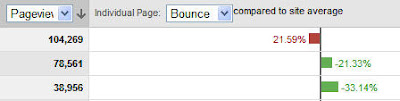
Click Go to see the filtered keywords. If there’s anything else you’ve missed, just add it to your exclude list and click Go again. Here are the results for the Google Store.


That’s all there is to it. Try it on your own data and leave us a comment letting us know what you find!

Rabu, 06 Oktober 2010

Back To Basics: Part 3 - The Power of Exclusion

In Part 2, we saw that a store owner gained an unexpected lift in search traffic to his website after running a promotion on a referring site. The questions we left until this week to answer are these: How many extra searches resulted from the promotion? And, what keywords did people search on?

To answer these questions, we need to compare what usually happens versus what actually happened after the promotion. A good way to do this is to use the Compare to Past feature on the date range selector. If we compare the previous week with the promotion week, we can see how much of a lift there was after the promotion.


Notice that we use the exact same days, Monday through Sunday, so that the days of the week line up. Here is the resulting graph. The green line is the search traffic leading up to the promotion (what he would ordinarily expect without a promotion); the blue line is the search traffic during and after the promotion.


From the report below, you can see the specific increase for each keyword.


The promotion resulted in a 209.68% increase in searches on the first keyword and an increase of 1,242.86% in searches on the second keyword. That’s good to know. It looks like one day promotions are the way to go for this business.

This is good example of how to use Compare to Past. You might also want to check out this tip on how to line up your date ranges when using Compare to Past.

Rabu, 29 September 2010

Back To Basics: The Power of Exclusion (Part 2)

Last week, we saw how a website owner removed traffic from his latest promotion to study the effects of that promotion on his data. The blue line represents all visits over a 2-week period. The spike in the middle is due to a 50%-off referral-based promotion.

The yellow line is where it gets interesting. This line represents all traffic except traffic from the promotional site. Since the yellow line excludes the promotional referrals, why does it show a spike in traffic?


To find out, the store owner de-selected the All Visits segment so that only the Exclude Promo Site segment was active.


Then, he looked at each of the reports in the Traffic Sources section -- the Direct Traffic report , Referring Sites report, and Search Engines report-- to find out where the non-promo traffic spike was coming from. Here’s the graph he saw when he looked at the Search Engines report.


It turns out the extra traffic was coming from search. Happily, the referral site promotion had been even more successful than expected. Because not only was there a big spike in traffic due to the referral, there was also a spike from search. As a result of the increased exposure, more people were searching for his store.

With that mystery solved, we’re ready for the next step. How can we find out how many extra searches resulted from the promotion? And, exactly which keywords were people searching on? We’ll take a look in Part 3, next week.

Rabu, 22 September 2010

Back-To-Basics: The Power of Exclusion

I have a friend who owns a store in my neighborhood. He decided to run a 50%-off special on a site that specializes in one-day promotions to its members. His goal was to get wider exposure for his store and gain some new customers. If you look at the graph, you can see that the day that the promotion ran, traffic to his site spiked. Traffic then dropped off to normal the next day, but this was expected given the nature of this particular campaign.


The store owner was happy to see the spike in traffic, but he wanted to learn more. So he did something clever and created an advanced segment. But instead of creating an advanced segment for traffic from just the promotional site, he did the exact opposite. He created a segment that excluded all the promotional traffic.

Why? It’s a great example of what I call the power of exclusion. More about that in a minute, but first let’s look at how you would create a segment that excludes traffic from a specific site.

First, click the Advanced Segments drop down and click “Create a new advanced segment”.


From the menu on the left, drag Source into the working area. Select the condition “Does not contain”. Enter the name of the site from which you want to exclude traffic, for example “example.com”. Then name and save the segment.


To apply the segment, click the Advanced Segments drop down again and select your newly created segment. (You’ll see it under Custom Segments.) In this case, I named this segment “exclude promo site”.


Take a look at the graph below and you’ll see why this was a smart idea. The blue line is all traffic. The orange line is all traffic except traffic from the promotional site. Notice something interesting? That’s right. The orange line also shows a spike, even though it doesn’t include any referrals from the promo site.


This is the power of exclusion: If you want to find out how effective something is -- whether it’s a traffic source, a promo, or a campaign -- try excluding its influence from your data. You might be surprised at what you find.

So, why is there a traffic spike in the “exclude promo site” segment? Tune in next week and find out. In the meantime, watch this short video tutorial to re-acquaint yourself with advanced segments.

Rabu, 25 Agustus 2010

Back to Basics: Fast Segments with Analytics Intelligence

Did you know that there’s a quick way to create advanced segments from automatic alerts? This is one of those “I can’t believe how powerful this is and yet so easy to do” features. Let me illustrate with an example from the Google Store site. A few months ago, on February 5, the Google Store received a surge of traffic from TechCrunch.com. We would not have noticed this extra traffic were it not for Analytics Intelligence. In the following screenshot, you can see that the store ordinarily receives between 0 and 221 visits from TechCrunch, but on this day, it received 1,918 visits.


What happened was that TechCrunch ran an article about Google scarves that were being sold in the store. But, here’s the tip I want to share with you. First, you can graph just the
relevant traffic simply by clicking the button on the alert.


And, you can create an advanced segment just by clicking the Create Segment link at the far right of the alert.


Now you can compare this traffic side by side with overall site traffic or with traffic from other segments. Check out this video to see how this works and to learn more automatic alert tips.

Posted by Alden DeSoto, Google Analytics Team

Rabu, 11 Agustus 2010

Back to Basics: Filtering Keywords


Let’s say you’re only interested in keywords that brought in visitors who spent at least 2 minutes on your site.


When you enter the condition for Avg Time on Site, you’ll need to use seconds. So, here, we’ve entered 120 seconds (=2 minutes).

Or, perhaps you only want the keywords with a bounce rate of less than 30%. (Make sure you use .3 for 30%. So, for example, .05 is 5%, .25 is 25%, and 1 is 100%.)


You can even enter multiple conditions. In this case, we want to weed out all the low traffic keywords as well.


Advanced Filters are a great way to focus on your most important keywords. To see this example in action, watch this short video.


Rabu, 04 Agustus 2010

Back to Basics: Keyword/Landing Page Combinations

Starting today, we’re reinstating the Back To Basics series. Each Wednesday, we’ll share a Google Analytics tip, usually something that you can try right away with your own data to gain new insights. This week, we’ll illustrate a quick way to see how many visits you get from different keyword/landing page combinations.

A friend of mine recently created several new landing pages that she hoped would attract traffic. She wanted to see at a glance whether people who searched on her top keywords were seeing the new pages. While she knew that she could use the Top Landing Pages report to analyze each individual landing page, she wanted to see keyword/landing page combinations in a single report.

There’s an easy way to do this. Go to the Keywords report under Traffic Sources. Look over to the right above the table and you’ll see Views: followed by a set of buttons. Click the Pivot view (5th button from the left). Now, look to the left, above the table, and you’ll see a Pivot by dropdown menu. Select Landing Page from this menu.


Voilà! The keywords will be listed down the side and landing pages will be listed across the top. You can now see how many visits you received for each keyword/landing page combination.


You can see up to five landing pages listed across the top of the report. You can scroll horizontally (across the landing pages) using the arrow buttons at the top right of the table.


The pivot view is also really useful for seeing at a glance how many visits you get from each keyword and search engine combination. To do this, you’d use the same Keywords report and pivot by Source.

That’s this week’s tip. We’ll be back next Wednesday for another Back to Basics post.

Senin, 21 September 2009

Back To Basics: Save Clicks, Save Time

Did you know that you can save clicks and jump directly to a deep-level report from your dashboard? Let's say that you want to see which cities in California you get traffic from. Ordinarily, you'd need to click Visitors, then Map Overlay in the report navigation. Then, you'd need to click United States, then California. But, you can save 3 of these 4 clicks by simply adding this report to your dashboard.

Try it now. Go to one of your favorite reports that requires several clicks to access. Once you've arrived at the report you want --and at the level you want it -- click Add to Dashboard. (The Add to Dashboard button is at the top of your report on the left, next to the Export and Email buttons.)


You'll now see the report on your dashboard. The next time you log in to your Analytics account, you'll be able to see the top cities from California on your dashboard and jump right to the report with a single click.


Senin, 17 Agustus 2009

Back to Basics: Troubleshooting goals

One of the easiest ways to make sense of your data and measure business objectives for your website (and even assign a monetary value to them) is to create goals. However, once you've correctly implemented your tracking code and identified the pages you want to create goals for, you may run into some common goal set-up problems. Below are some tips to help you solve some common issues first-time Analytics users run into so that you can get going on the road to taking useful action with your Analytics goals.

Incorrect goal URL
One of the most common goal set-up errors is to enter the incorrect URL. To confirm that you're entering the URL correctly, try reaching the goal page on your own site and copying and pasting the URL into the 'Goal URL' field.

You can remove the domain name entirely from the field and Google Analytics will still track the page as a goal. For example, if your goal is http://www.mysite.com/1/thanks.html, you can safely use '/1/thanks.html' as your Goal URL.

Duplicate final goal step
When you have steps leading up to your goal, the last step you specify in the Goal Funnel Settings should be the final step prior to reaching your goal. The goal itself should be placed in the 'Goal URL' field and does not need to also be included as a last step.

Goal value error
It is possible that the Goal value entered includes non-numerical characters. If the goal value is set to $2,560, the error message is displayed because the value contains the characters "$" and ",". In this case, only the value 2560 will suffice.

Historical data not relevant
If you've recently applied a new goal, it will only apply to data processed after the goal was implemented, and not to historical data in your account. This is why you might not see data for your website if you haven't had anyone convert on a goal after you created one.

To read the full list of reasons why your goal creation failed, read this Google Analytics Help Article. For an in-depth explanation about goals and how to set them up, please read this previous post.

Senin, 10 Agustus 2009

Back to Basics: Direct, referral or organic - definitions straight from the source

In your Analytics reports, you'll see some of the same entries come up again and again in your data tables. In the last Back to Basics post, we learned about 'not set' entries -- this week we'll learn what it means when you see 'direct,' 'referral' and 'organic' under the Sources column in your reports.

  • (direct)[(none)] - Visitors who visited the site by typing the URL directly into their browser. 'Direct' can also refer to the visitors who clicked on the links from their bookmarks/favorites, untagged links within emails, or links from documents that don't include tracking variables (such as PDFs or Word documents).

  • [referral] - Visitors referred by links on other websites. (Links that have been tagged with campaign variables won't show up as [referral] unless they happen to have been tagged with utm_medium=referral. )

  • [organic] - Visitors referred by an unpaid search engine listing, e.g. a Google.com search.

Once you learn where the traffic to your site is coming from, you can start analyzing the information to make intelligent decisions for your website. For example, the Referring Sites report shows you which websites have been most effective at driving people to your site -- and which ones haven't been effective. Furthermore, if you have defined as goals the key pages you want visitors to see, you can see the percentage of visits from each referral during which the visitor saw these pages. (Just click Goals tab to see your conversion rates for each goal.)

To learn more about how to spot quality traffic from your Goals tab, please refer to this earlier Back to Basics post.

Rabu, 05 Agustus 2009

Back to Basics: "not set" Entries

From time to time you might see a "not set" entry in your Top Content or Keywords reports. Hopefully at this point you go to the Google Analytics Help Center to do a search for "not set" to find the definition. :) If you don't, not to worry - this blog post sums up why this entry appears in your report and what you can do to prevent it from happening in the future.

"not set"
Any direct visit or referral visit will be shown under "not set" because it does not have a keyword, ad content, or any other campaign information associated with the visit. The explanations below can help you figure out why a campaign attribute wasn't collected along with the visit.

Re-tagging your AdWords destination URLs
If you are seeing a significant amount of "not set" or '(not set)' entries in your AdWords-related reports, you may wish to disable auto-tagging and instead use the URL Builder to tag your destination URLs so that they're set to the specific campaign variables you want to appear in your reports.

gclid redirection for keywords
Sometimes Analytics users are master URL taggers and still see a "not set" keyword entry. Usually this happens when there is some kind of redirection and the gclid (which is the magic that makes autotagging happen) doesn't work the way it's supposed to. At this point, we recommend you do some detective work going backwards from what you know. Start by clicking on the "not set" entry, and from the Dimension menu, select 'Source' and then 'Medium.' You can also select 'Landing Page' in the Dimension menu if 'Source' or 'Medium' doesn't give you any clues about the missing keyword. These segmenting options should help you narrow down the source of this keyword so that you can pinpoint which keyword's gclid isn't behaving properly.

For more information, search the Google Analytics Help Center (it's important to include the quotation marks!) by entering "not set" in the search box. If you know of any other tips or tricks about "not set" entries, please feel free to post a comment.


Jumat, 17 Juli 2009

Back To Basics: Comparing Days Of The Week

You probably already know that you can quickly compare two date ranges against each other simply by clicking Compare to Past. So, in the screenshot below, clicking Compare to Past will allow me to compare the current period (Mar 16 - Apr 15) with the previous period (May 16 - May 15).


Once I click Apply, I'll see the graph below. The problem, though, is that this graph is not very useful to me as a comparison tool because the days of the week don't line up.


The first day of the current period (March 16) is a Monday, so I'll use the date slider to move the first day of the previous period back to Feb 9, also a Monday. Just click the Timeline tab to see the date slider and drag the previous period (in green) to the left, one day at a time. The date will change in the text box as you drag the slider. Then, click Apply.


Once I've lined up my days, I can compare weekdays to weekdays, and weekends to weekends. For example, I can see that, except for the first Wednesday, I received more traffic on all of the Wednesdays in the previous period.


Next time you use Compare to Past, try using the date slider to adjust your previous time period. It's possible that you'll uncover new insights about your day to day traffic.


Senin, 29 Juni 2009

Back to Basics: Free Google Analytics Tools

We've picked two free tools that anyone can use while setting up Google Analytics for your site. The tools below are pretty basic but are applicable to anyone tracking a campaign with an Analytics account.

URL Builder

The first tool we want to introduce our beginners to is the URL Builder. In order for Google Analytics to track your marketing campaigns effectively, you'll need to tag your online ads with the right information (e.g. campaign, medium and source) so that Google Analytics can track your marketing campaign and show you which activities are paying off. To help the the tagging process goes smoothly, you can use the URL Builder from our Google Analytics Help Center.

Tagging your campaign links will consist of a URL address followed by a question mark and your campaign variables. But, you won't need to worry about link syntax if you fill out the URL Builder form and press the Generate URL button. A tagged link will be generated for you and you'll be able to copy and paste it to your ad.


SiteScan

The Google Analytics SiteScan tool, created by EpikOne, a Google Analytics Authorized Consultant, is a very handy tool to verify that all pages on your site include the tracking code.

SiteScan picks up on some classic signs indicating that your site has improperly implemented tracking code like:

1. No data in your account. (The tracking code was either never implemented or has the wrong account number)
2. You're seeing a high bounce rate even though your site isn't a blog and has more than one page. (If you've only tagged your homepage, your Google Analytics account will be unable to identify any other pageviews from your site. )

SiteScan then reports each page in an easy-to-read CSV file after you've installed the tool. This makes it easy for you to isolate the pages with tracking problems, fix them, and effectively manage your Google Analytics Tracking Code installation.


We're constantly working on developing tools to diagnose problems associated with your account or increase the usability of Google Analytics. We hope that you find the above two tools useful and leave us a comment about any other diagnostic tools you would like to tell us about on this blog!


Senin, 08 Juni 2009

Back to Basics: Filtering out your own IP address

If you have a team of people on your marketing team constantly checking the website you're tracking with Google Analytics, filtering out specific IP addresses is one of the ways you can make sure you're not tracking irrelevant visits to your site. Excluding these IPs may help you get more accurate numbers for metrics like average time on site (since your marketing team probably spends the most time on your site every day), your visitors' geographic locations, etc.

To start filtering out IPs, follow the steps below:

  1. Collect IPs from anyone in your office (including yourself) that you don't want to track. If they don't know what their IP addresses are, an easy way to figure it out is to go to http://whatismyipaddress.com/.
  2. Then, sign in to your Analytics account at http://www.google.com/analytics.
  3. If you have more than one account, select the account that has the profile you want to apply the IP exclusion filter to.
  4. Once you're on the Profile Overview page, click 'Edit' from underneath the Actions column.
  5. From under the 'Filters Applied to Profile' section, select 'Add Filter.'
  6. Select 'Add new Filter for Profile.'


  7. Enter an easily identifiable Filter name (i.e. 'My IP address,' or 'CMO's IP address).
  8. Select the filter type labeled 'Exclude all traffic from an IP address.' The IP address field will auto-populate with an example IP address. Enter the correct value. Remember to use regular expressions when entering any IP address. For example, if the IP address to filter is:

    176.168.1.1
    then the
    IP address value will be:
    176\.168\.1\.1


  9. You may also enter a range of IP addresses. For example:
    Range: 176.168.1.1-25 and 10.0.0.1-14
    IP address value : ^176\.168\.1\.([1-9]|1[0-9]|2[0-5])$|^10\.0\.0\.([1-9]|1[0-4])$
  10. Click ‘Save changes’ to finish.

Senin, 01 Juni 2009

Back to Basics: Setting up Google Analytics on your Blog

Today's post covers how to install Google Analytics on the Blogger and WordPress blogging platforms. Adding analytics to your blog can tell you things like:
  • Which referring sites send you the best traffic
  • Which visitors are most likely to subscribe to your email list
  • Which keywords have the highest engagement
  • Which articles have the lowest bounce rate
  • Which articles monetize best using AdSense
  • and much more.
For more information about how web analytics can be useful for bloggers, check out Avinash Kaushik's post on useful goals for blogs.

Installing Google Analytics on Blogger

Installing Google Analytics on Blogger is very easy. Here are the basic steps:
  1. Sign up for a Google Analytics account
  2. Add the GA tracking code to your Blogger template
  3. Wait 24 hours and login to Google Analytics to start analyzing your data
For a detailed explanation of how to complete a successful installation, read this tutorial created by eblogstemplates.

Installing Google Analytics on WordPress

You can use the same basic steps above to install Google Analytics on a WordPress blog. The team at WordPress has produced this terrific step by step video explaining this process. A huge thanks to Michael Pick for his hard work in creating this. Note, you can also use a plugin like the Analyticator plugin we described last week to install Analytics on your WordPress blog.


To view the video in a larger size, visit wordpress.tv. For more videos on Google Analytics, visit the Google Analytics YouTube Channel.

Leave a Comment

That's it for now. Still having trouble? Visit the help forum or leave a comment and let us know where you're stuck. Have you used analytics for your blog? Tell us about it!

Senin, 18 Mei 2009

Back to Basics: Graph mode

One way Google Analytics can help you quickly spot trends and anomalies is through the 'Graph mode' feature. This feature lets you compare multiple metrics on your graph to see if there are any obvious correlations. You can graph by one metric, compare one metric to another (e.g. visitors versus average time on site), or compare a metric to your site average. Once you graph your selected metrics, you can roll your mouse over the graph to see the actual values of the two metrics you're comparing.

For example, let's say your site saw a sudden surge in traffic from an search engine optimization effort. You can use the 'Graph mode' option to graph 'visits' and '% new visitors' on the same graph. This will show you whether the SEO campaign successfully reached new visitors or whether it was more successful in driving repeat visits.


To use graph mode, click the pulldown menu in the top left of the graph of a selected report. Then, select the graph view you'd like to see. To finish, click the pulldown menu tab one more time.


Senin, 11 Mei 2009

Back to Basics: Emailing reports

Usually reports are mailed out to marketing managers or directors to measure any change in progress from week-to-week. With Google Analytics, you can make the process completely automated -- you can schedule your reports to be emailed daily, weekly, monthly, or quarterly. To start emailing your reports in PDF, CSV, XML, and TSV format, just click the 'Email' icon above all your reports:

This Help Center article has comprehensive instructions on how to schedule your reports or email them on the fly.

If after scheduling reports you want to delete them, you can do so at any time by going to the 'Manage Scheduled Emails' dashboard. This may be a little hard to find since you have to click a separate 'Email' icon in the reports page.

To delete a scheduled email, please follow these steps:

1. Find the other 'Email' icon on the left hand side of the reports page. Look at the image below to get an idea of where it's located.


2. After clicking the icon, you should see a list of scheduled reports. Click the icon that looks like a trash can in the upper right hand corner to delete them forever.


Hopefully after reading this post, you've automated sending out reports and have one less thing to worry about on Mondays!

Senin, 04 Mei 2009

Back to Basics: An easy way to spot quality traffic

Your site may be getting a lot of traffic from referring sites, but which websites refer visitors that actually convert to a goal? There’s a basic report that can show you where your quality traffic is coming from: the Traffic Sources report.

To spot which website links are referring visitors that convert to your goals, follow these steps:

1. On the main ‘View Reports’ screen, choose
Traffic Sources in the lefthand navigation.

2. In the same area you'll now see a list of subset of reports. Click on 'Referring Sites.'

3. Now you'll see a report of all the top sites that refer traffic to you ("referral" = the user clicked a link on the
sourcesite). Click on the Goal Conversion tab.

4. Now you'll see the top 10 referral domains. In the bottom gray section, choose a larger number for 'show rows' in order to see them all.

5. You'll get a breakdown of goal conversion percentages for every referral. Right above the data table, you'll see a score card listing your site average's data so that you can compare it to the information coming from specific sources.

Of course, for this report to actually show goal conversion data, you’ll need to have created goals for your website. You can either read a quick how-to from our Help Center, watch a video, or view a GA IQ learning module on it.

If you run an ecommerce site and would like some more information on identifying valuable referrers, you may want to check out this post written by one of our Authorized Consultants.


Senin, 27 April 2009

Back to Basics: Using Motion Charts


The Motion Charts feature seems like an advanced tool, but it's actually designed for Analytics users at all levels. It's useful for spotting trends and relationships amongst individual variables when your visits may look flat as an aggregated set of data. Today, we'll illustrate how Motion Charts can graph and compare several keywords over time.

For example, let's say you want to graph traffic over time for each of the top keywords in the report below. You can easily do so by going to the Keywords report under the 'Traffic Sources' section.

Of course, you can click each keyword to see a graph over time, but this doesn't allow you to make comparisons.


However, Motion Charts allow you to graph and compare individual keyword performance over time. To access Motion Charts click the "Visualize" button at the top of most reports, such as the "Keyword" report located under "Traffic Sources."


You can now see that, except for a dip in traffic between Mar 23 and Mar 30, "google store" sent more traffic every day than the other keywords. "google downloads" sent the least amount traffic each day.

But this graph also provides a bonus. If you set the size of the dots to represent revenue, you can identify the days during which traffic actually paid off in revenue. For example, "google store" doesn't generate revenue every day (even when it sends lots of traffic). "google shop" and "google software" frequently generate revenue, but not as much as "google store".

Generating this graph is easy. Just follow these steps:

  1. Go the Keywords report (or any other report with table data) and click 'Visualize.'
  2. Select "Time" for the X-axis and "Visits" on the Y-axis. For Size, select "Revenue" (or any other metric you want to track).
  3. Now, select the keywords you want to graph (use the 'Select' box below the 'Size' menu) and select Trails. Press 'Play' or drag the slider across to the end of the time period.

After following these steps, a graph like the image above should appear. If you've selected a lot of keywords, your labels may bunch together, but you can drag and reposition the labels to see parts of the graph that are obscured.

Of course, you can use this technique on any report which has a 'Visualize' button. If you discover a new use for this technique, please post a comment and share your best practice with us.

Senin, 20 April 2009

Back to Basics: Pressing the right buttons

One of the many ways Google Analytics keeps its reports dynamic with interesting data is to add buttons and other interactive features for you to analyze your reports with. Almost every report has over ten clickable features for you to jigger with, so this can get overwhelming for beginners -- especially if they've always seen their reports as flat pie charts or data tables.

Below are a few examples of how you can use these features and implement them as a part of your report analysis routine.


1. The 'Graph by' button

Beneath the date range selector for your graphs, there is a 'Graph by' feature that lets you graph your data by day, week, or month so you can analyze trends according to the selected view. Some Visits reports have an additional hourly view you can graph by if you really need that extra granular level of data. Get more details about each graph view here.

2. 'Views' button

The 'Views' buttons underneath the graph gives you the option to view your top content data by a variety of criteria - either by data table, pie chart, bar graph, or comparison view.


For the Top Content report, the 'Comparison' view is very useful to spot which pages outperform or underperform the site average. In the Comparison view shown above, we've sorted the pages based on the number of pageviews they each received and are comparing the bounce rate for each page to the site average. We can instantly see that the page that received the most page views also underperformed the site average in terms of bounce rate. But the second and third pages out performed the site average bounce rate.

Read some tips about keeping your visitors on your site and improving your site's conversion health.


3. Dimension segmenting pull-down menu

The 'Dimension' pull-down menu lets you segment one report within Google Analytics by one variable, giving you further context about your visitors. For the content detail reports, you can see how people came to a particular page by changing the dimension to 'Source,' or see what kind of traffic has been referring people by clicking 'Medium.'

If your site is seen in multiple languages, try selecting 'languages' for the dimension. Once you see an unusual spike in visits for a particular language or country, try modifying your site to serve your customers (i.e. translating certain pages or adding country-specific products) and see if your conversions grow, like this guy's. You never know if Mexicana music is enjoying a new revival in Venezuela!

4. Graph mode option

Visualize and compare two metrics at a time for a selected report by selecting from the 'Graph mode' pull-down menu in your reports. Comparing two metrics can show trends you may not have been able to spot solely from within your data table. Although there isn't much actionable insight this feature may give you, you can use it to raise some educated guesses about your traffic patterns and test them out.

To learn how to use the multi-line graphing feature, please read this article.


Hopefully this post has you starting out your week by pressing all the right buttons in your reports!