Below are a few examples of how you can use these features and implement them as a part of your report analysis routine.


1. The 'Graph by' button
Beneath the date range selector for your graphs, there is a 'Graph by' feature that lets you graph your data by day, week, or month so you can analyze trends according to the selected view. Some Visits reports have an additional hourly view you can graph by if you really need that extra granular level of data. Get more details about each graph view here.
2. 'Views' button
The 'Views' buttons underneath the graph gives you the option to view your top content data by a variety of criteria - either by data table, pie chart, bar graph, or comparison view.

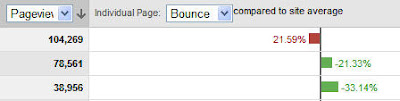
For the Top Content report, the 'Comparison' view is very useful to spot which pages outperform or underperform the site average. In the Comparison view shown above, we've sorted the pages based on the number of pageviews they each received and are comparing the bounce rate for each page to the site average. We can instantly see that the page that received the most page views also underperformed the site average in terms of bounce rate. But the second and third pages out performed the site average bounce rate.
Read some tips about keeping your visitors on your site and improving your site's conversion health.
3. Dimension segmenting pull-down menu
The 'Dimension' pull-down menu lets you segment one report within Google Analytics by one variable, giving you further context about your visitors. For the content detail reports, you can see how people came to a particular page by changing the dimension to 'Source,' or see what kind of traffic has been referring people by clicking 'Medium.'
If your site is seen in multiple languages, try selecting 'languages' for the dimension. Once you see an unusual spike in visits for a particular language or country, try modifying your site to serve your customers (i.e. translating certain pages or adding country-specific products) and see if your conversions grow, like this guy's. You never know if Mexicana music is enjoying a new revival in Venezuela!
4. Graph mode option
Visualize and compare two metrics at a time for a selected report by selecting from the 'Graph mode' pull-down menu in your reports. Comparing two metrics can show trends you may not have been able to spot solely from within your data table. Although there isn't much actionable insight this feature may give you, you can use it to raise some educated guesses about your traffic patterns and test them out.
Hopefully this post has you starting out your week by pressing all the right buttons in your reports!
Tidak ada komentar:
Posting Komentar